Plotting different Confidence Intervals around Fitted Line using R and ggplot2
In this blog post, I’ll show that how we can plot different confidence intervals i.e., 90%, 95% or 99% around the fitted line in R using ggplot2 library.
Load libraries
library(tidyverse)
library(stargazer)
library(patchwork)
Load data
For this blog post, I’ll use the built in cars data set. The data set contains only 2 variables i.e., speed and distance.
data("cars")
glimpse(cars)
## Rows: 50
## Columns: 2
## $ speed <dbl> 4, 4, 7, 7, 8, 9, 10, 10, 10, 11, 11, 12, 12, 12, 12, 13, 13, 13…
## $ dist <dbl> 2, 10, 4, 22, 16, 10, 18, 26, 34, 17, 28, 14, 20, 24, 28, 26, 34…Simple Linear Regression
At first, I’ll fit a simple linear regression model for distance against speed.
model <- lm(dist ~ speed, data = cars)
stargazer::stargazer(model, type = "text")
##
## ===============================================
## Dependent variable:
## ---------------------------
## dist
## -----------------------------------------------
## speed 3.932***
## (0.416)
##
## Constant -17.579**
## (6.758)
##
## -----------------------------------------------
## Observations 50
## R2 0.651
## Adjusted R2 0.644
## Residual Std. Error 15.380 (df = 48)
## F Statistic 89.567*** (df = 1; 48)
## ===============================================
## Note: *p<0.1; **p<0.05; ***p<0.01- We can see a significant positive association between distance and speed.
- As the speed increases, the distance also increases.
Now, we want to visualize this fitted model. An easy way is that we can use the geom_smooth function of ggplot2 package to show a trend line of association between speed and distance. geom_smooth also provides a built in function to plot the confidence interval around the fitted line.
Note: 95% confidence interval is the default level. However, we can change the levels manually also.
Fitted line with 95% confidence level
p1 <- cars %>%
  ggplot(aes(x = speed, y = dist)) +
  geom_point(colour = "black") +
  geom_smooth(method = "lm", se = TRUE) +
  labs(title = "95% Confidence Interval") +
  theme_bw() +
  theme(plot.title = element_text(face = "bold",hjust = 0.5))

p1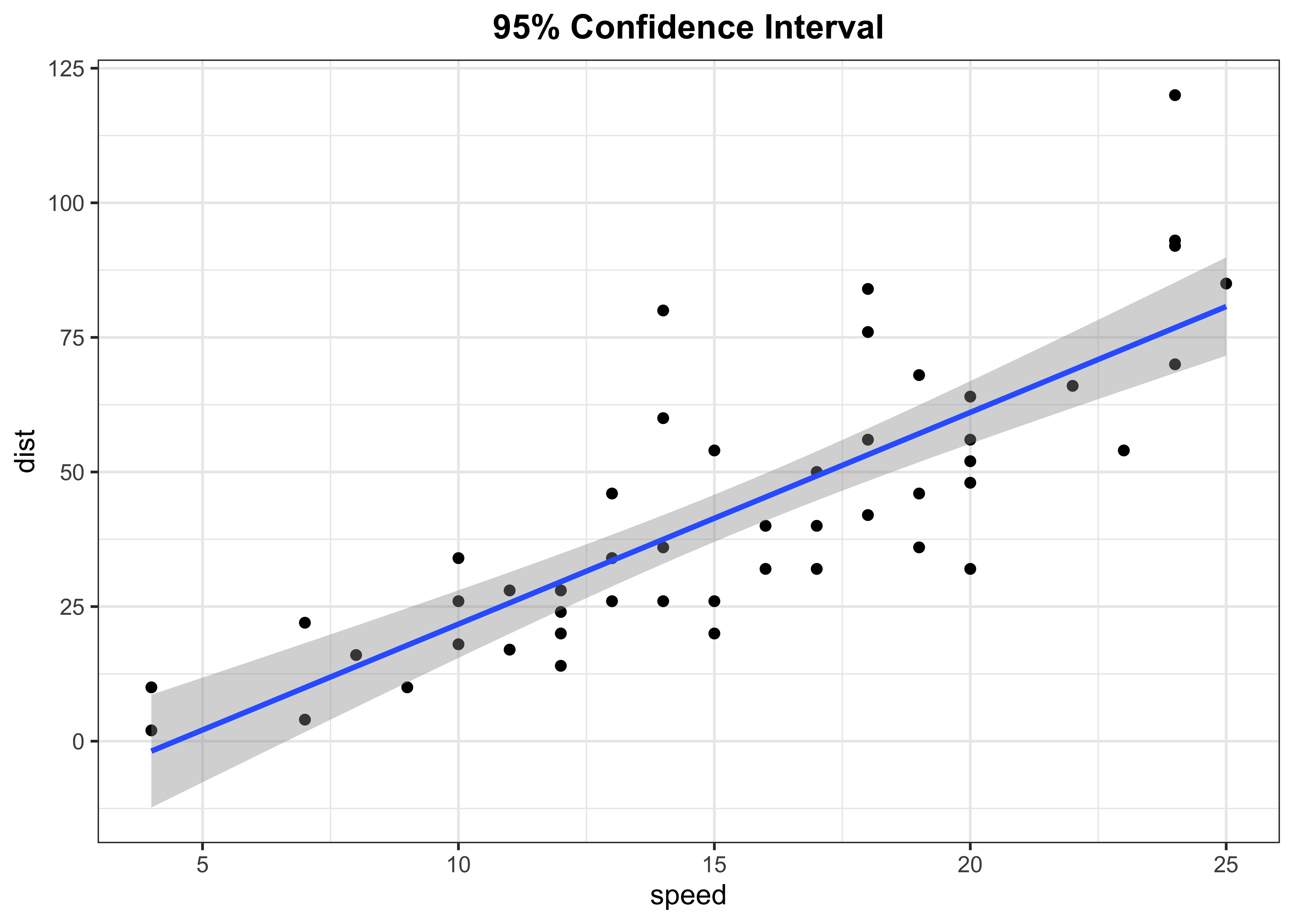
Fitted line with 90% confidence level
p2 <- cars %>%
  ggplot(aes(x = speed, y = dist)) +
  geom_point(colour = "black") +
  geom_smooth(method = "lm", se = TRUE, level = 0.90) +
  labs(title = "90% Confidence Interval") +
  theme_bw() +
  theme(plot.title = element_text(face = "bold",hjust = 0.5))

p2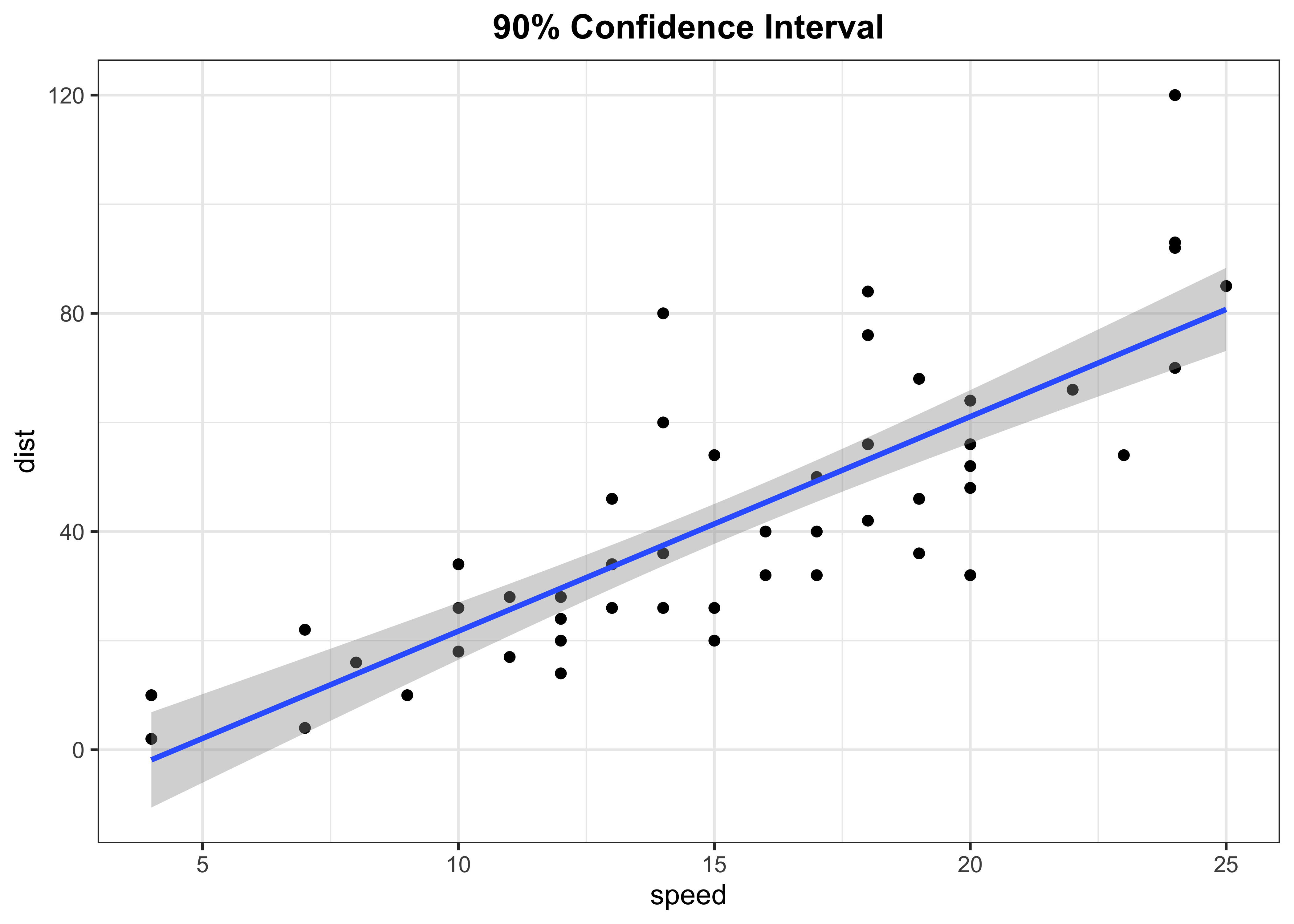
Fitted line with 90% confidence level
p3 <- cars %>%
  ggplot(aes(x = speed, y = dist)) +
  geom_point(colour = "black") +
  geom_smooth(method = "lm", se = TRUE, level = 0.99) +
  labs(title = "99% Confidence Interval") +
  theme_bw() +
  theme(plot.title = element_text(face = "bold",hjust = 0.5))

p3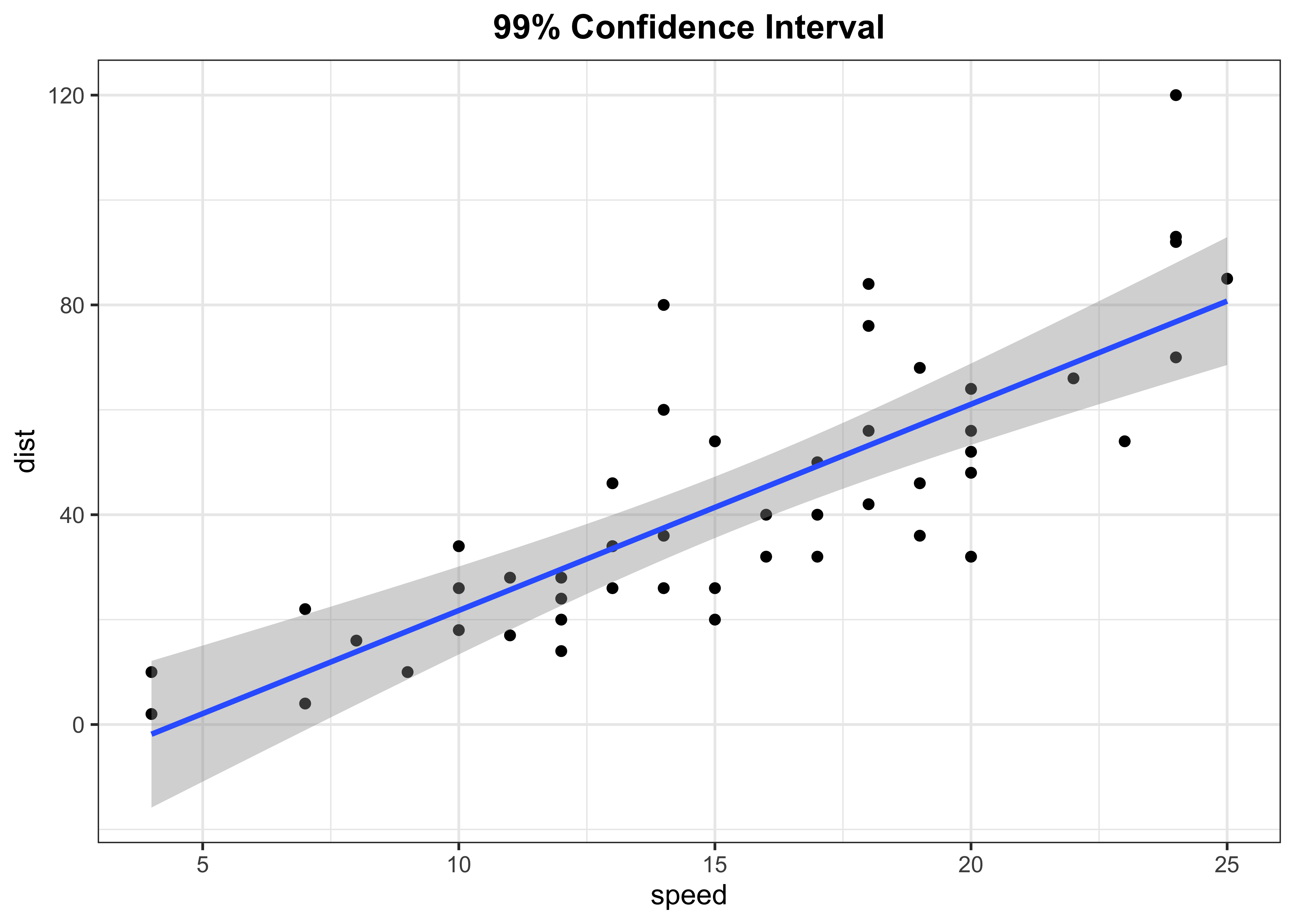
Stacking
p1 + p2 + p3 + plot_layout(ncol = 2)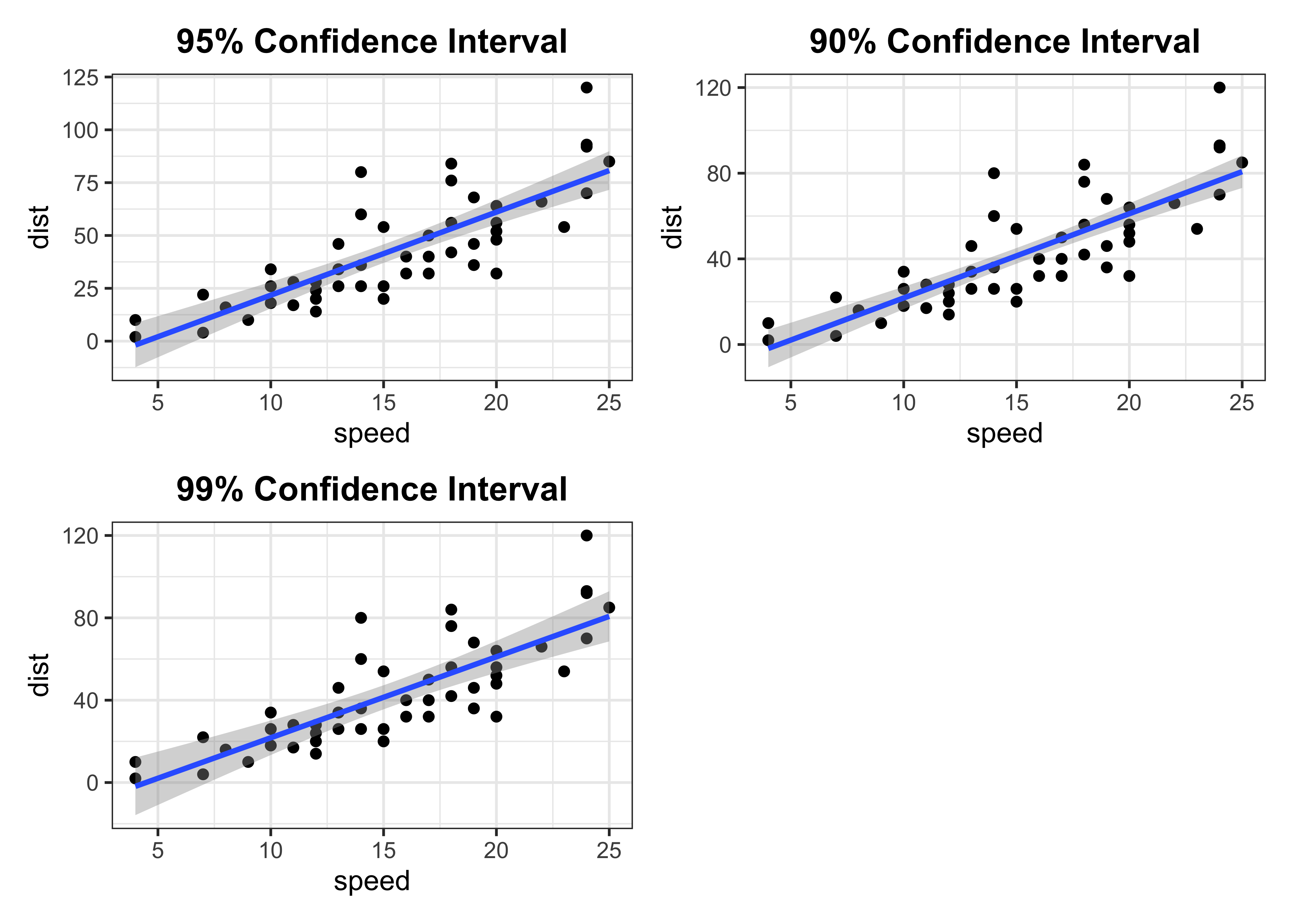
This is an easiest way to plot confidence intervals in R and ggplot2 even without fitting a regression model separately. However, sometime we want to compare different confidence interval bounds in a single scatter plot. In that case we need some creativity and extra lines of code. I know there can be different ways to achieve this but here is how I had accomplished this task.
- First, I’ll extract the confidence intervals of fitted line using the
predictfunction.
Extract confidence intervals data
# CI
ci90 <- predict(model, cars, interval = "confidence", level = 0.90)
ci95 <- predict(model, cars, interval = "confidence", level = 0.95)
ci99 <- predict(model, cars, interval = "confidence", level = 0.99)- After that, I’ll bind these data sets using the
bind_rowsfunction. Before binding, I’ll create an ID variable for eachdata.frameto keep track of the data.
# bind data
ci_pred <- as.data.frame(ci90) %>%
  mutate(ID = "90%") %>%
  bind_rows(as.data.frame(ci95) %>%
              mutate(ID = "95%"),
            as.data.frame(ci99) %>%
              mutate(ID = "99%")
              )

head(ci_pred)
## fit lwr upr ID
## 1...1 -1.849460 -10.591699 6.892779 90%
## 2...2 -1.849460 -10.591699 6.892779 90%
## 3...3 9.947766 3.050136 16.845396 90%
## 4...4 9.947766 3.050136 16.845396 90%
## 5...5 13.880175 7.563250 20.197100 90%
## 6...6 17.812584 12.050540 23.574627 90%- After that, I’ll join this data back with
carsdata usingbind_colsfunction followed by some data wrangling.
# Joining with cars data
final_data <- cars %>%
  bind_cols(
    ci_pred %>%
      remove_rownames() %>%
      pivot_wider(names_from = ID, values_from = c(lwr, upr)) %>%
      unnest()
  ) %>%
  pivot_longer(names_to = "key", values_to = "value", cols = 4:9) %>%
  separate(key, into = c("Type", "Level"), sep = "_") %>%
  pivot_wider(names_from = Type, values_from = value) %>%
  unnest()

head(final_data)
## # A tibble: 6 × 6
## speed dist fit Level lwr upr
## <dbl> <dbl> <dbl> <chr> <dbl> <dbl>
## 1 4 2 -1.85 90% -10.6 6.89
## 2 4 2 -1.85 95% -12.3 8.63
## 3 4 2 -1.85 99% -15.8 12.1
## 4 4 10 -1.85 90% -10.6 6.89
## 5 4 10 -1.85 95% -12.3 8.63
## 6 4 10 -1.85 99% -15.8 12.1- Now we have the cleaner data that contains fitted data along with confidence intervals at different levels.
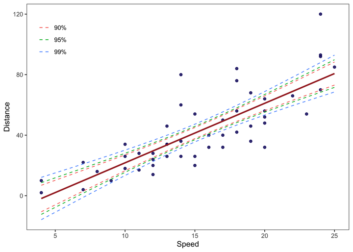
- We can use this data to plot the confidence bounds around the fitted line in a single scatter chart.
Final Plot
final_data %>%
  ggplot(aes(x = speed, y = dist, color = Level)) +
  geom_point(colour = "midnightblue", alpha = 0.5) +
  geom_smooth(method = "lm", se = F, colour = "brown") +
  geom_line(aes(y = lwr), lty = 2) +
  geom_line(aes(y = upr), lty = 2) +
  labs(x = "Speed", y = "Distance", color = NULL) +
  theme_test() +
  theme(legend.position = c(0.08, 0.85))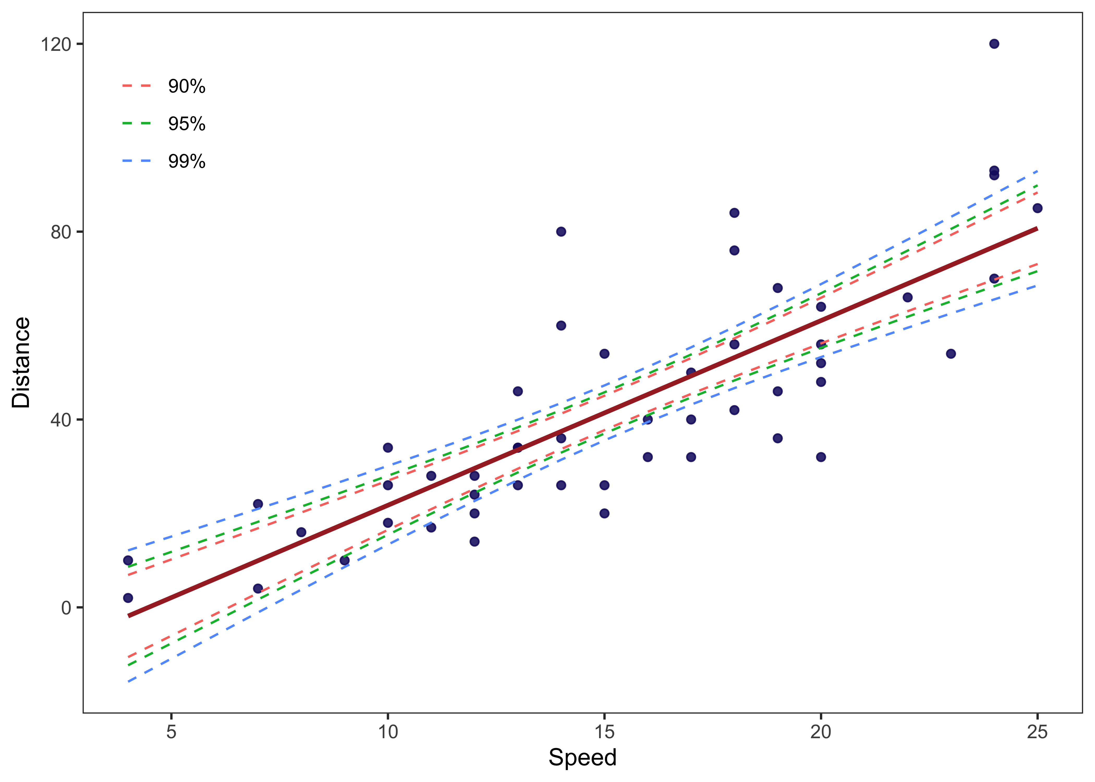
That’s it!
Feel free to reach me out if you got any questions.
Muhammad Mohsin Raza
Data Scientist
My research interests include disease modeling in space and time, climate change, GIS and Remote Sensing and Data Science in Agriculture.