Making Publication Quality Inset Maps in R using ggplot2
When publishing scientific research in journals or presenting research work at a conference, showing maps of data collection sites or experimental locations is one of the key visualizations. Maps of study sites/locations can help the audience and readers to fathom the data in a better way.
Mapping sounds fancy, but it needs substantial training and skill set to make high-quality maps that are reader-friendly and visually aesthetic. Sometimes, the study sites are more dispersed and are easy to visualize in large geographic areas. However, in some cases, study sites are clustered, which makes it hard to show them on a broader scale. In that case, inset maps help us show the locations with reference to familiar geographical regions.
An inset map is a smaller map featured on the same page as the main map. Traditionally, inset maps are shown at a larger scale (smaller area) than the main map. Often, an inset map is used as a locator map that shows the area of the main map in a broader, more familiar geographical frame of reference.
Load libraries
library(tidyverse)
library(readxl)
library(ozmaps)
library(grid)
library(gt)
Load data
For this blog post, I’ll use geographical coordinates data of different experimental sites in New South Wales, Australia. These sites consist of Adaptation and Demonstration trials on different weed grasses.
Experiment coordinates
# coordinates
data <- read.csv("https://raw.githubusercontent.com/MohsinRamay/sampledata/main/GPS_coordinates_for_map.csv") %>%
  select(-3)

gt(head(data))| Site | Weed.species | Latitude | Longitude | Town |
|---|---|---|---|---|
| Demonstration site | African lovegrass | -36.20866 | 149.1540 | Cooma |
| Demonstration site | Chilean needle grass | -31.28349 | 151.0604 | Tamworth |
| Demonstration site | Serrated tussock | -34.86234 | 149.1745 | Yass |
| Adaptation site | African lovegrass | -36.77778 | 149.6928 | Candelo |
| Adaptation site | African lovegrass | -36.26293 | 149.1360 | Cooma |
| Adaptation site | African lovegrass | -35.92521 | 149.2420 | Bredbo |
Map of Australia
I’ll extract the map of Australia from the ozmaps package using the ozmap function.
# Australia map
sf_aus <- ozmap("states")
Closest city names
I’ll extract the closest city names and their coordinates from the original data set by filtering the first row of each grouped Town data.
# cities
town <- data %>%
  arrange(Town) %>%
  group_by(Town) %>%
  filter(row_number()==1) %>%
  ungroup()

gt(town)| Site | Weed.species | Latitude | Longitude | Town |
|---|---|---|---|---|
| Adaptation site | African lovegrass | -30.51559 | 152.0523 | Armidale |
| Adaptation site | African lovegrass | -35.92521 | 149.2420 | Bredbo |
| Adaptation site | Serrated tussock | -35.35779 | 149.4252 | Bungendore |
| Adaptation site | Serrated tussock | -34.06857 | 149.6068 | Burraga |
| Adaptation site | African lovegrass | -36.77778 | 149.6928 | Candelo |
| Demonstration site | African lovegrass | -36.20866 | 149.1540 | Cooma |
| Adaptation site | Serrated tussock | -34.14433 | 149.5829 | Fullerton |
| Adaptation site | Serrated tussock | -34.94073 | 148.0043 | Gundagai |
| Adaptation site | Chilean needle grass | -30.26109 | 151.7033 | Guyra |
| Adaptation site | Serrated tussock | -33.20287 | 149.4203 | Killongbutta |
| Adaptation site | African lovegrass | -35.72653 | 149.1498 | Michelago |
| Demonstration site | Chilean needle grass | -31.28349 | 151.0604 | Tamworth |
| Demonstration site | Serrated tussock | -34.86234 | 149.1745 | Yass |
| Adaptation site | African lovegrass | -34.10189 | 148.5149 | Young |
Map
At first, I’ll create a simple map for the whole country of Australia with experimental sites. I’ll use different symbols for site types and different colors for weed grasses.
Raw Map
data %>%
  ggplot() +
  geom_sf(data = sf_aus) +
  geom_point(aes(x = Longitude, y = Latitude, color = Weed.species, shape = Site)) +
  xlim(112, 155) +
  labs() +
  theme_bw()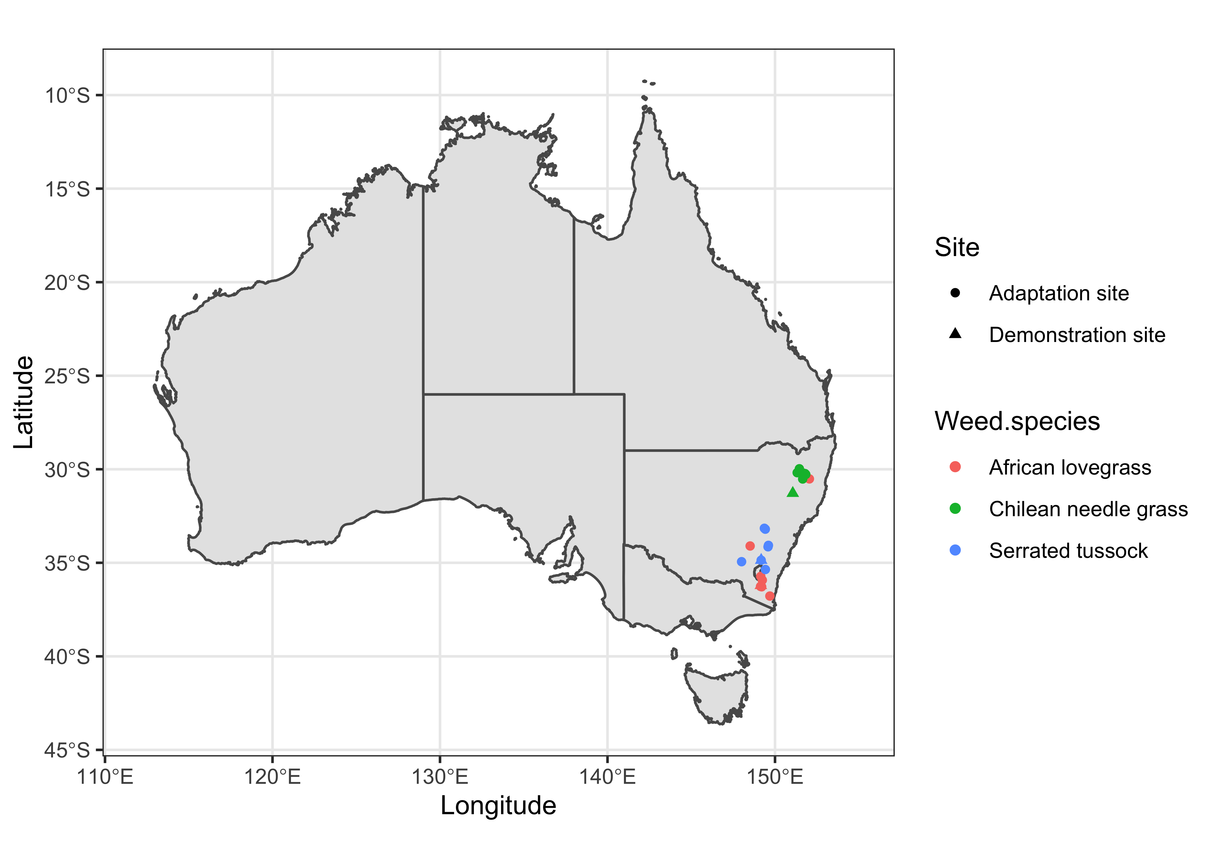
As you can see, the study sites are clustered (in New South Wales) when plotted on the country-wide scaled map. However, to make a better sense of the study locations with reference to nearby cities/towns, we need to plot them on a focused scale. For that purpose, we first need to identify the extent of the study sites.
Extent
I’ll used simple horizontal and vertical lines to visualize the extent of study sites.
data %>%
  ggplot() +
  geom_sf(data = sf_aus) +
  geom_point(aes(x = Longitude, y = Latitude, color = Weed.species, shape = Site)) +
  xlim(112, 155) +
  geom_hline(yintercept = -38, lty = 2, colour = "red") +
  geom_hline(yintercept = -29, lty = 2, colour = "red") +
  geom_vline(xintercept = 147, lty = 2, colour = "red") +
  geom_vline(xintercept = 153, lty = 2, colour = "red") +
  labs() +
  theme_bw()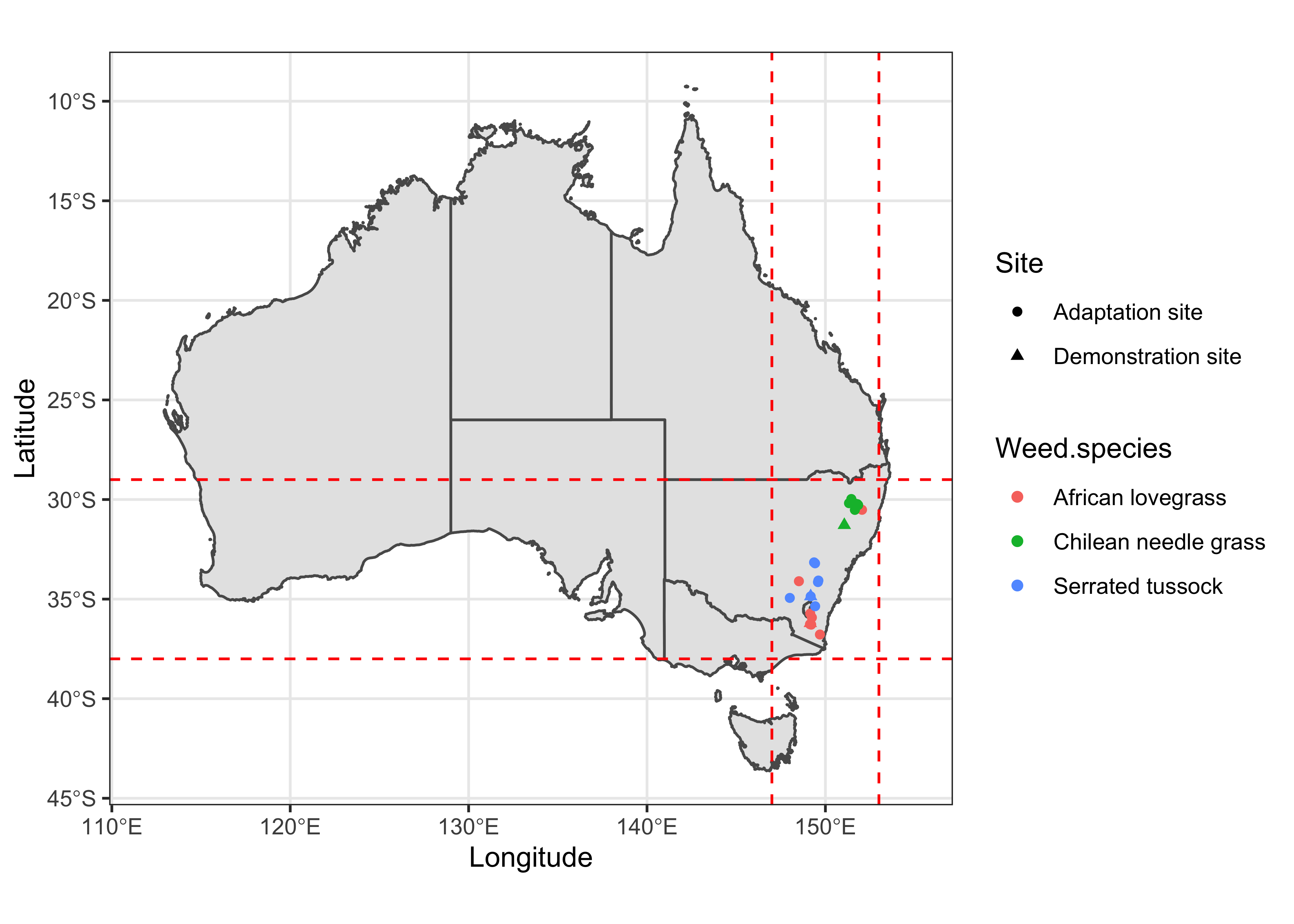
Using the min and max values of coordinates from previous map, we can draw a polygon over the study sites and see if this extent can best visualize the data.
data %>%
  ggplot() +
  geom_sf(data = sf_aus) +
  geom_point(aes(x = Longitude, y = Latitude, color = Weed.species, shape = Site)) +
  xlim(112, 155) +
  geom_rect(aes(xmin = 147, xmax = 153, ymin = -38, ymax = -29), color = "red", fill = NA) +
  labs() +
  theme_bw()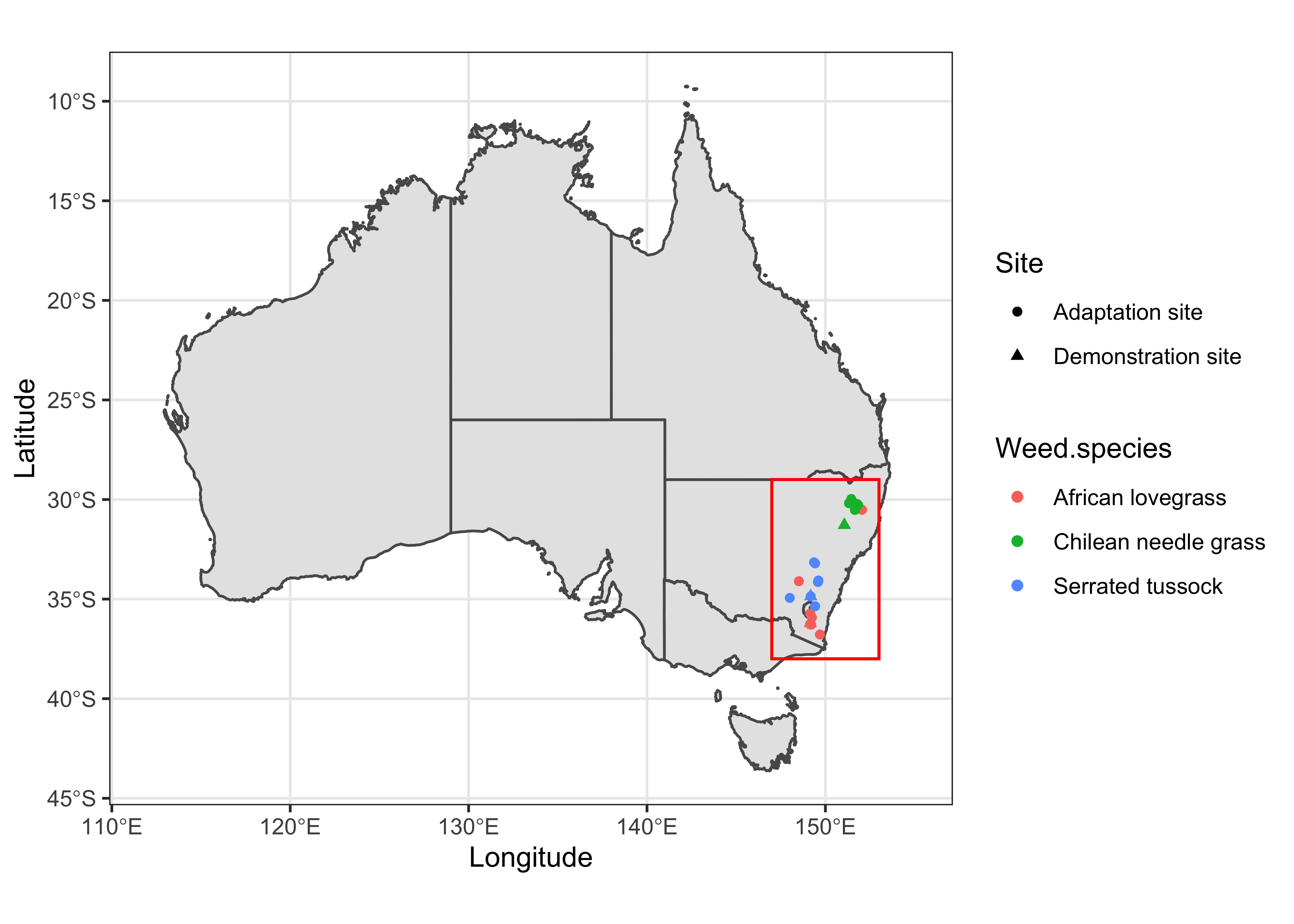
Focus Map
Now, I’ll plot a focused version of the study sites using the extent coordinates determined in the previous steps.
data %>%
  mutate(point_size = ifelse(Site == "Demonstration", 1, 0)) %>%
  ggplot() +
  geom_sf(data = sf_aus) +
  geom_point(aes(x = Longitude, y = Latitude, color = Weed.species, shape = Site, size = point_size > 0), alpha = 0.75) +
  scale_size_manual(values=c(2,3.5)) +
  xlim(147, 153) +
  ylim(-38, -30) +
  theme_test() +
  guides(size = "none")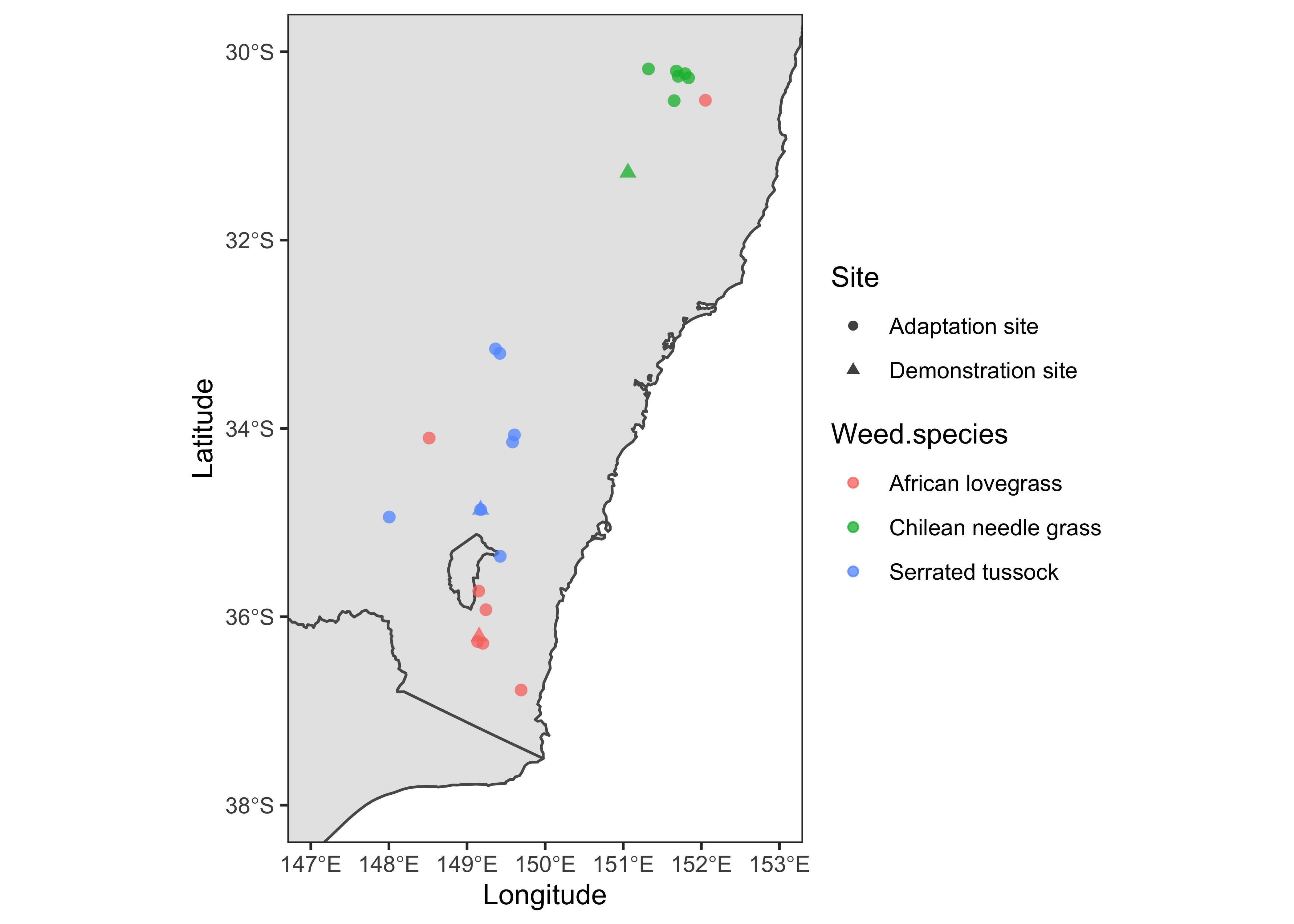
This version looks better compared to the previous one. However, we need to add some information to give it a reference. Also, we need to remove the borderline of Canberra in the southern part of New South Wales. For that purpose, I’ll dissolve the boundary line using the st_union function of library sf. We’ll then use the dissolved polygon in subsequent maps.
# Now the dissolve
library(sf)

AN = sf_aus %>%
  filter(NAME %in% c("New South Wales", "Australian Capital Territory"))

NM <- st_union(AN)

plot(NM)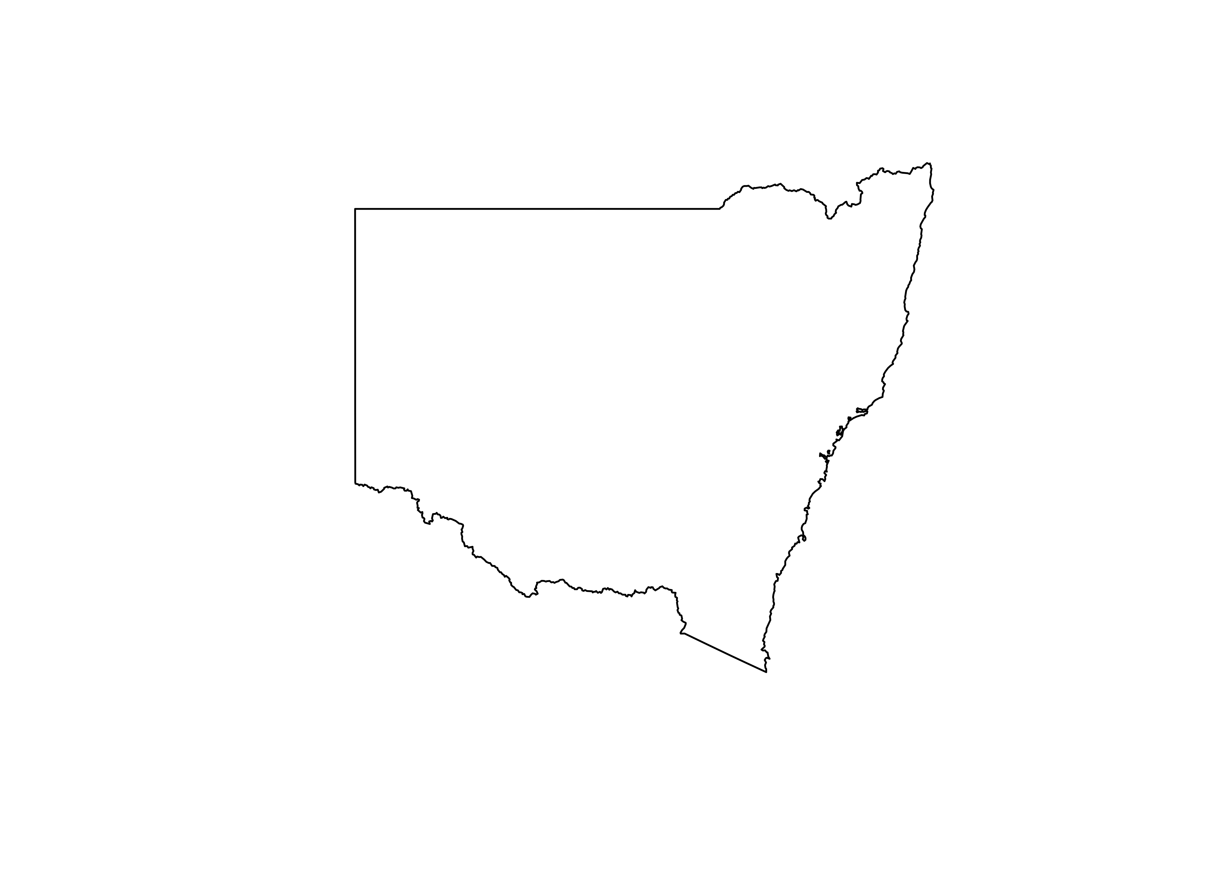
Add Map elements
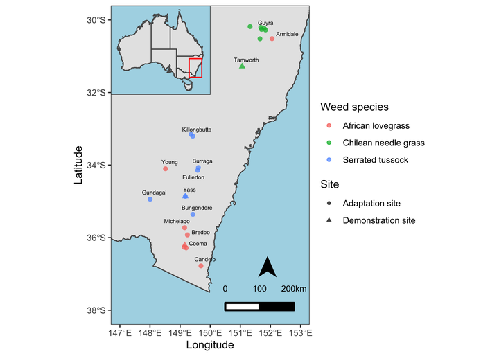
Professional maps also include some elements like North Arrow and scale etc. We’ll add these components to our map as well. Besides that, I’ll also add the closest town names and fill the non-land area with lightblue color for reference and distinction respectively.
ss <- data %>%
  mutate(point_size = ifelse(Site == "Demonstration", 1, 0)) %>%
  ggplot() +
  geom_sf(data = NM) +
  geom_point(aes(x = Longitude, y = Latitude, color = Weed.species, shape = Site, size = point_size > 0), alpha = 0.75) +
  scale_size_manual(values=c(2,3.5)) +
  xlim(147, 153) +
  ylim(-38, -30) +
  ggrepel::geom_text_repel(aes(x = Longitude, y = Latitude, label = Town), data = town, nudge_y = 0.06, nudge_x = 0.06, size = 2) +
  labs(color = "Weed species") +
  theme_test() +
  theme(panel.background = element_rect(fill = "lightblue")) +
  guides(size = "none") +
  ggsn::north(location = "topleft", scale = 0.8, symbol = 12,
               x.min = 151.5, x.max = 152.5, y.min = -36, y.max = -38) +
  ggsn::scalebar(location = "bottomleft", dist = 100,
           dist_unit = "km", transform = TRUE,
           x.min=150.5, x.max=152, y.min=-38, y.max=-30,
           st.bottom = FALSE, height = 0.025,
           st.dist = 0.05, st.size = 3)

ss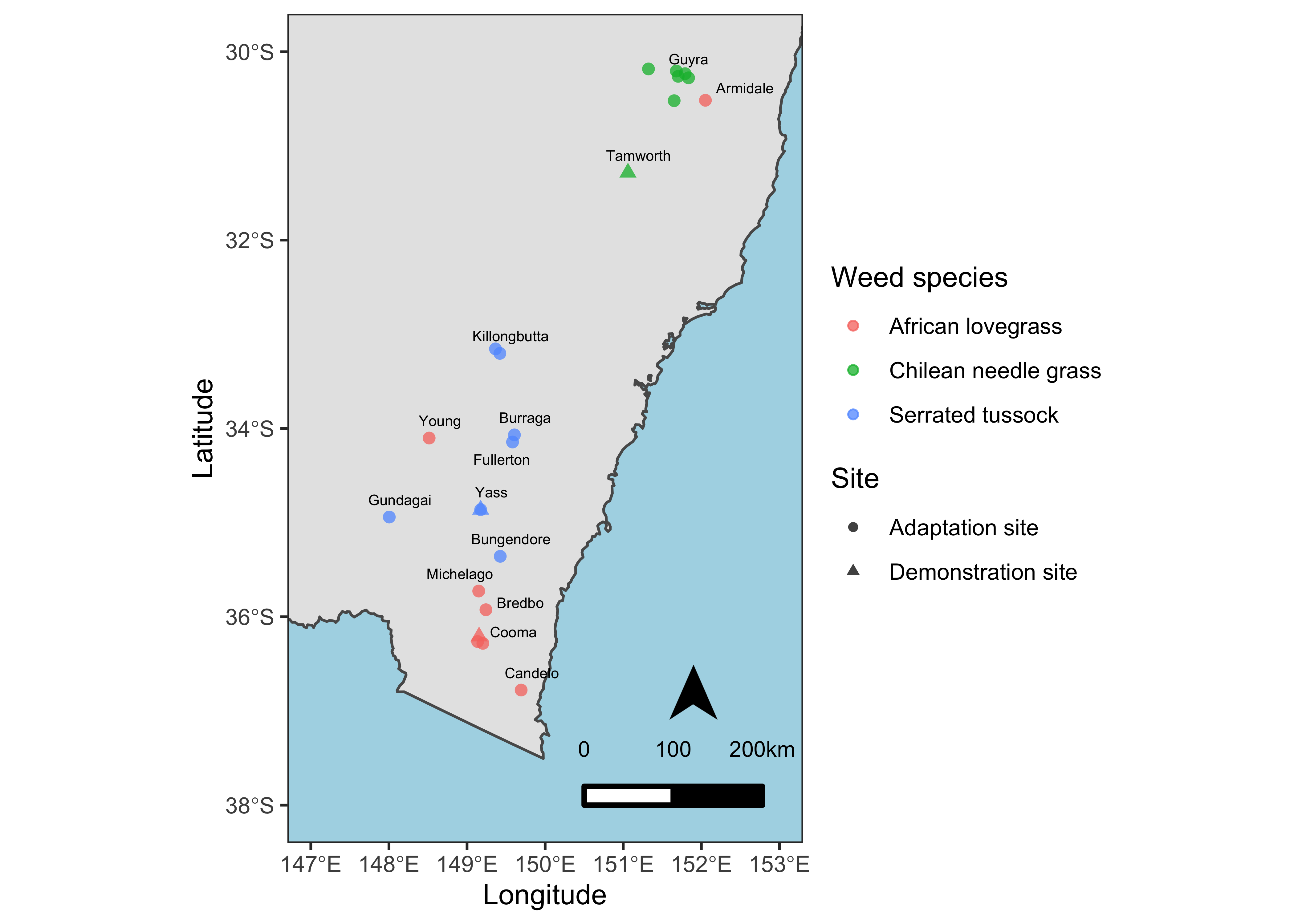
Inset Map
Now, I’ll create a full-scale map of Australia with a red polygon showing the extent of study sites and the focused map.
# Map of Australia
inset <- sf_aus %>%
  ggplot() +
  geom_sf() +
  #geom_sf(data = NM) +
  geom_rect(aes(xmin = 147, xmax = 153, ymin = -38, ymax = -30), color = "red", fill = NA) +
  xlim(112, 155) +
  labs(x = NULL, y = NULL) +
  theme_test() +
  theme(axis.text = element_blank(),
        axis.ticks = element_blank(),
        axis.ticks.length = unit(0, "pt"),
        axis.title=element_blank(),
        plot.margin = margin(0, 0, 0, 0, "cm"),
        panel.background = element_rect(fill = "lightblue"))

inset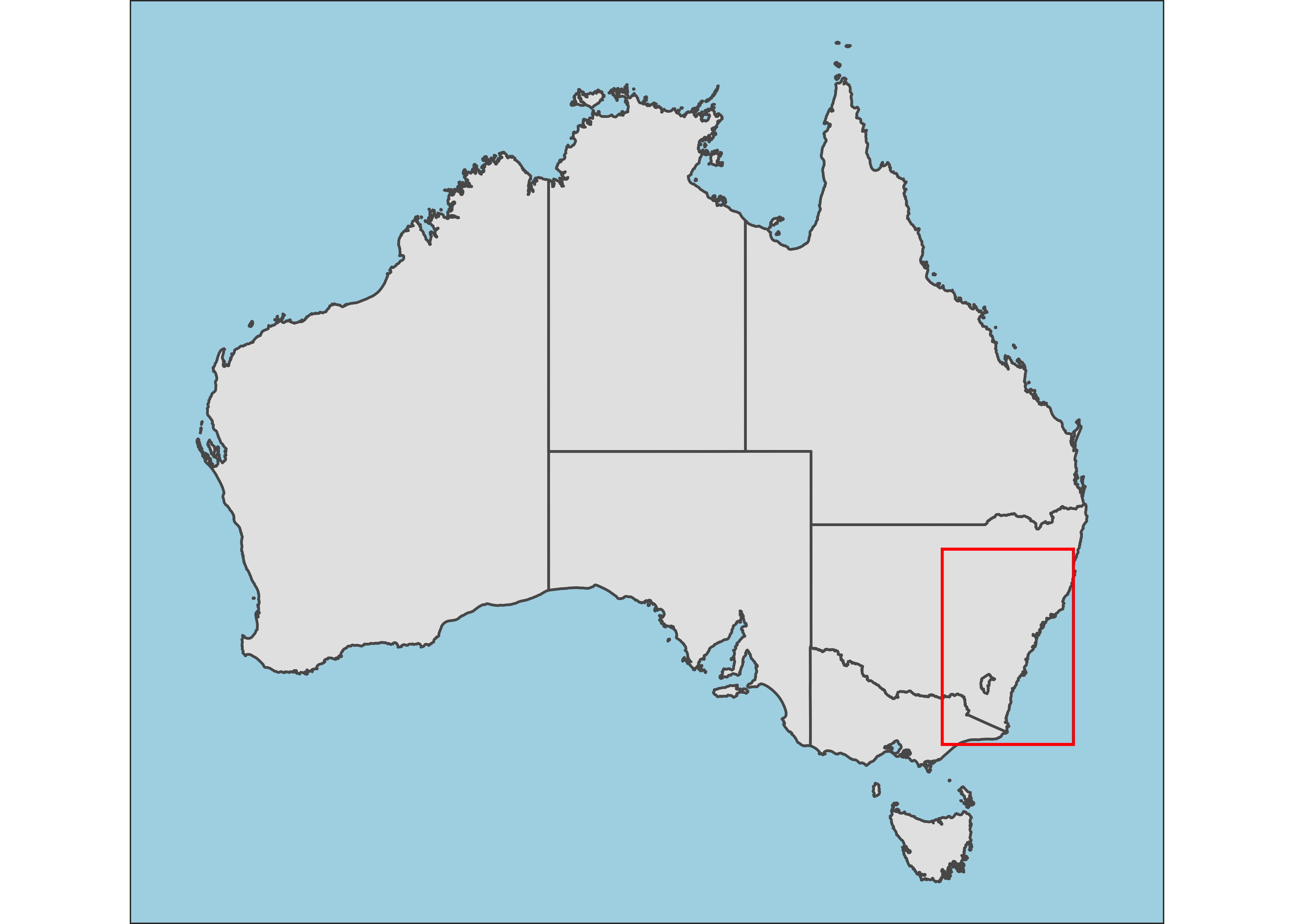
Final Map
Now, I’ll combine both maps where the map of Australia is inset on the upper left corner.
ss

# Combining both maps
print(inset, vp = viewport(0.322, 0.859, width = 0.25, height = 0.25))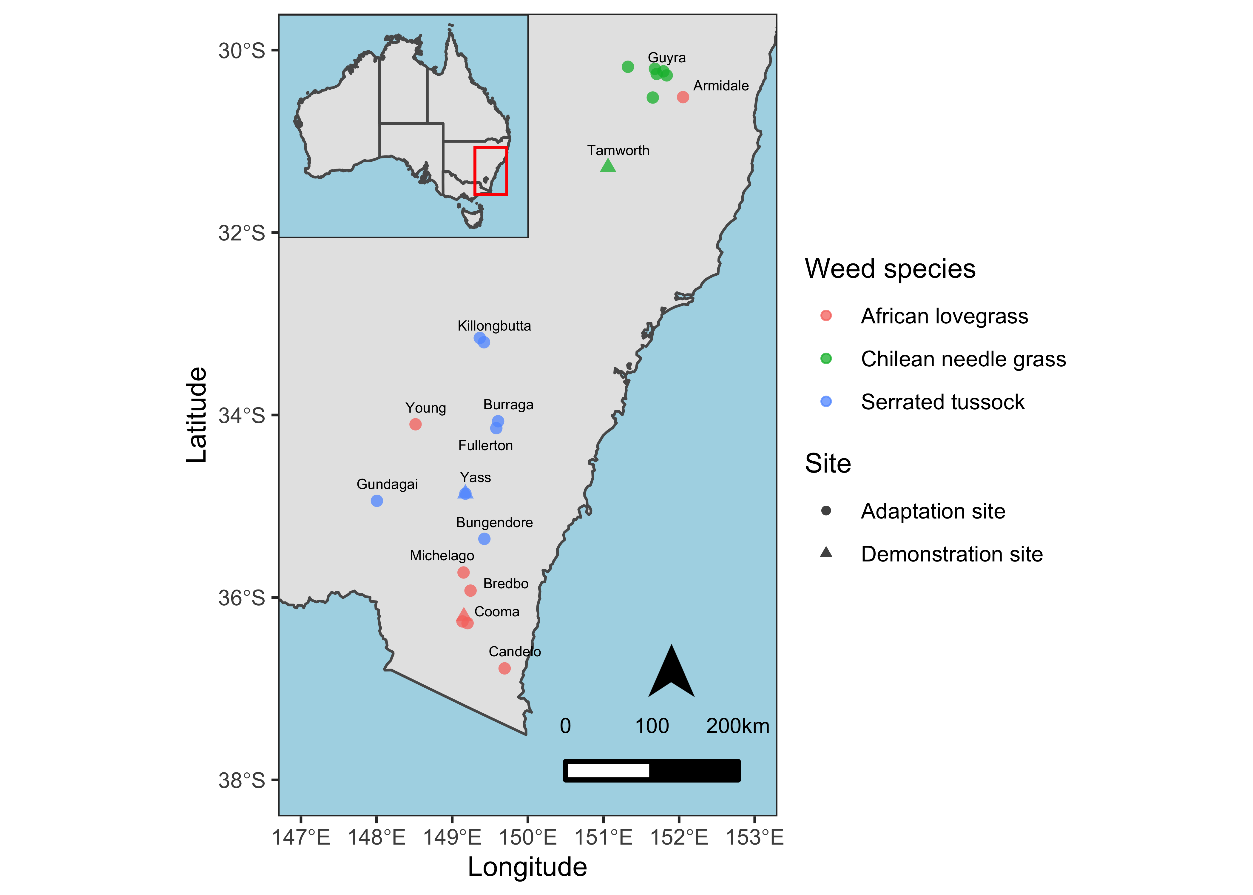
This inset map better shows the locations of study sites with reference to the country and provinces and is more professional.
That’s it!
Feel free to reach me out if you got any questions.
Muhammad Mohsin Raza
Data Scientist
My research interests include disease modeling in space and time, climate change, GIS and Remote Sensing and Data Science in Agriculture.