Generating different spatial patterns in R and their visualization using ggplot2
Spatial pattern is the arrangement of individual entities in space and the geographic relationships among them. Identification of spatial patterns is a prerequisite to understanding the complicated spatial processes underlying the distribution of a phenomenon. And this understanding is obscure without visualization.
Spatial patterns can help understand behaviors of phenomena occurring in space and time. For example, spatial patterns can help us pinpoint the source of a disease outbreak (hotspot), track the spread of an epidemic, efficiently allocate resources, risk monitoring, and urban planning, to name a few.
Spatial patterns can vary from case to case. We now have plenty of resources and analytical tools to analyze and visualize spatial data to obtain insights for solid and effective decision-making. However, we do not have much of the resources to generate patterns hypothetically for sampling and teaching purposes.
In this blog post, I’ll use basic features like matrix in R to generate different patterns and then visualize those patterns using the ggplot2 package. These examples can help design sampling schemes and educate students about spatial data and their analysis.
Load libraries
library(tidyverse)
library(reshape2)
At first, I’ll make an empty matrix using the matrix function and visualize it.
Empty Matrix
# 4x4 matrix
m <- matrix(nrow = 4, ncol = 4, byrow=TRUE)

# matrix visualization
melt(m) |>
  ggplot(aes(x = Var2, y = Var1, label = "NA")) +
  geom_tile(color = "black", fill = NA, size = 1) +
  geom_text() +
  theme_void() +
  theme(legend.position = "none")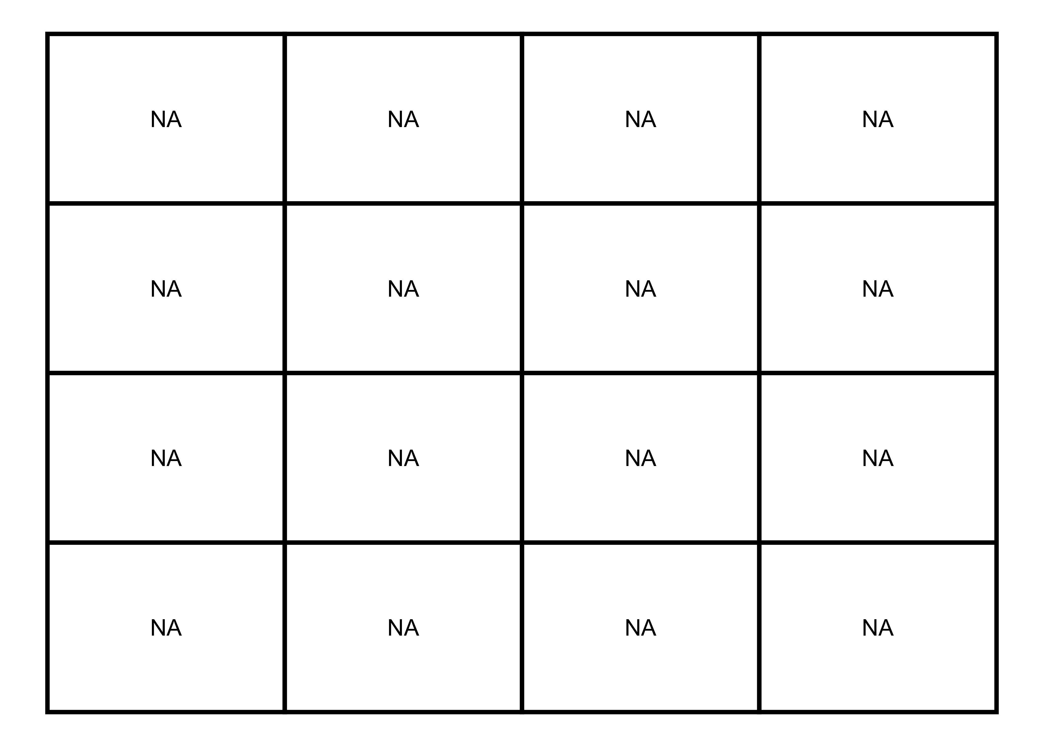
Filling matrix with values
Now, I’ll fill this matrix with only zeros.
Zeros
# 4x4 matrix with zeros
m <- matrix(0, nrow = 4, ncol = 4, byrow=TRUE)

# matrix visualization
melt(m) |>
  ggplot(aes(x = Var2, y = Var1, label = value)) +
  geom_tile(color = "black", fill = NA, size = 1) +
  geom_text() +
  labs(fill = NULL) +
theme_void() 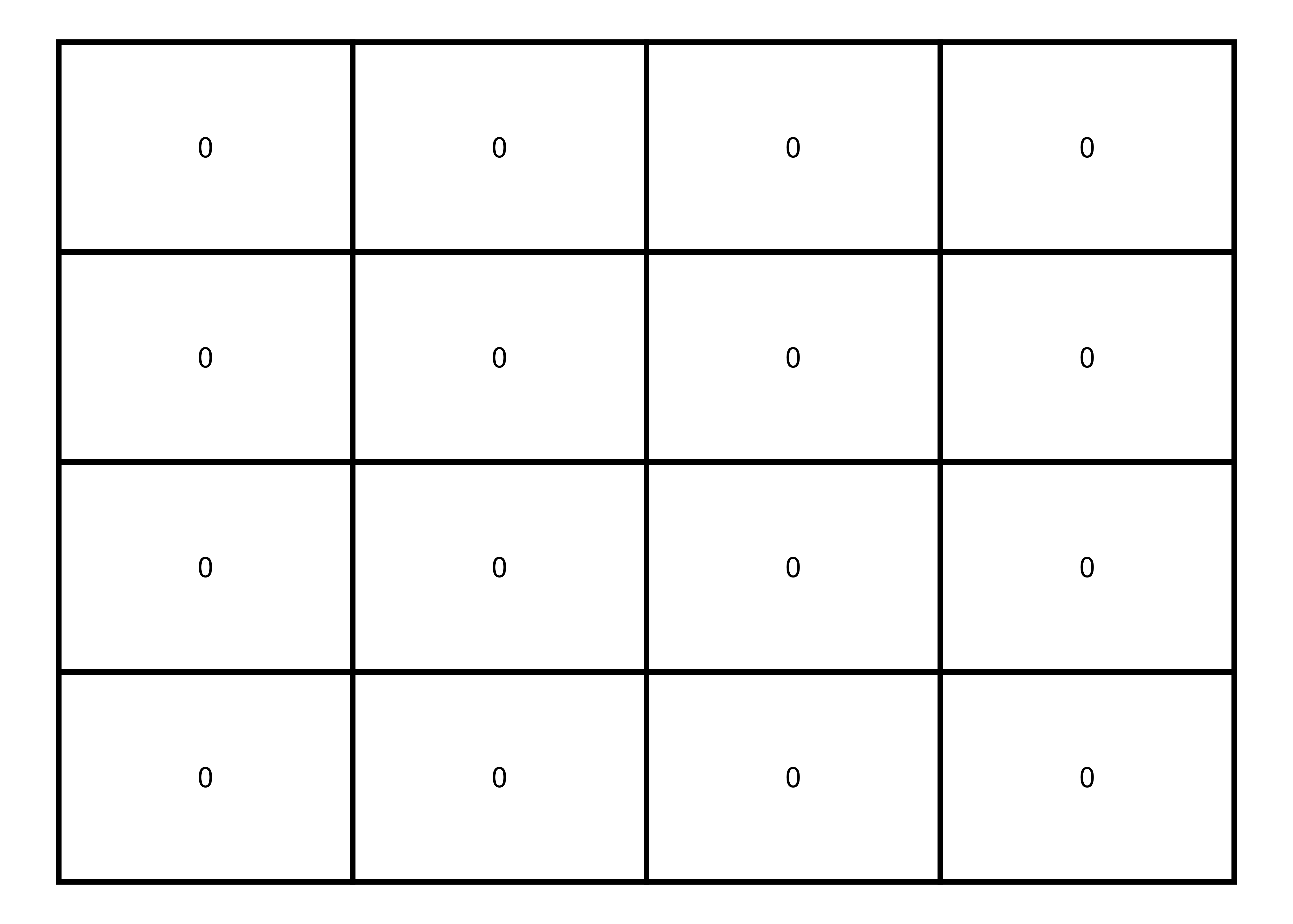
Then, I’ll add the ones to generate some patterns.
Zeros and ones
# 4x4 matrix with zeros and ones
m <- matrix(0:1, nrow = 4, ncol = 4, byrow=TRUE)

# matrix visualization
melt(m) |>
  ggplot(aes(x = Var2, y = Var1, fill = factor(value), label = value)) +
  geom_tile(color = "black", size = 1) +
  scale_fill_manual(values = c("white", "orange")) +
  geom_text() +
  labs(fill = NULL) +
theme_void() 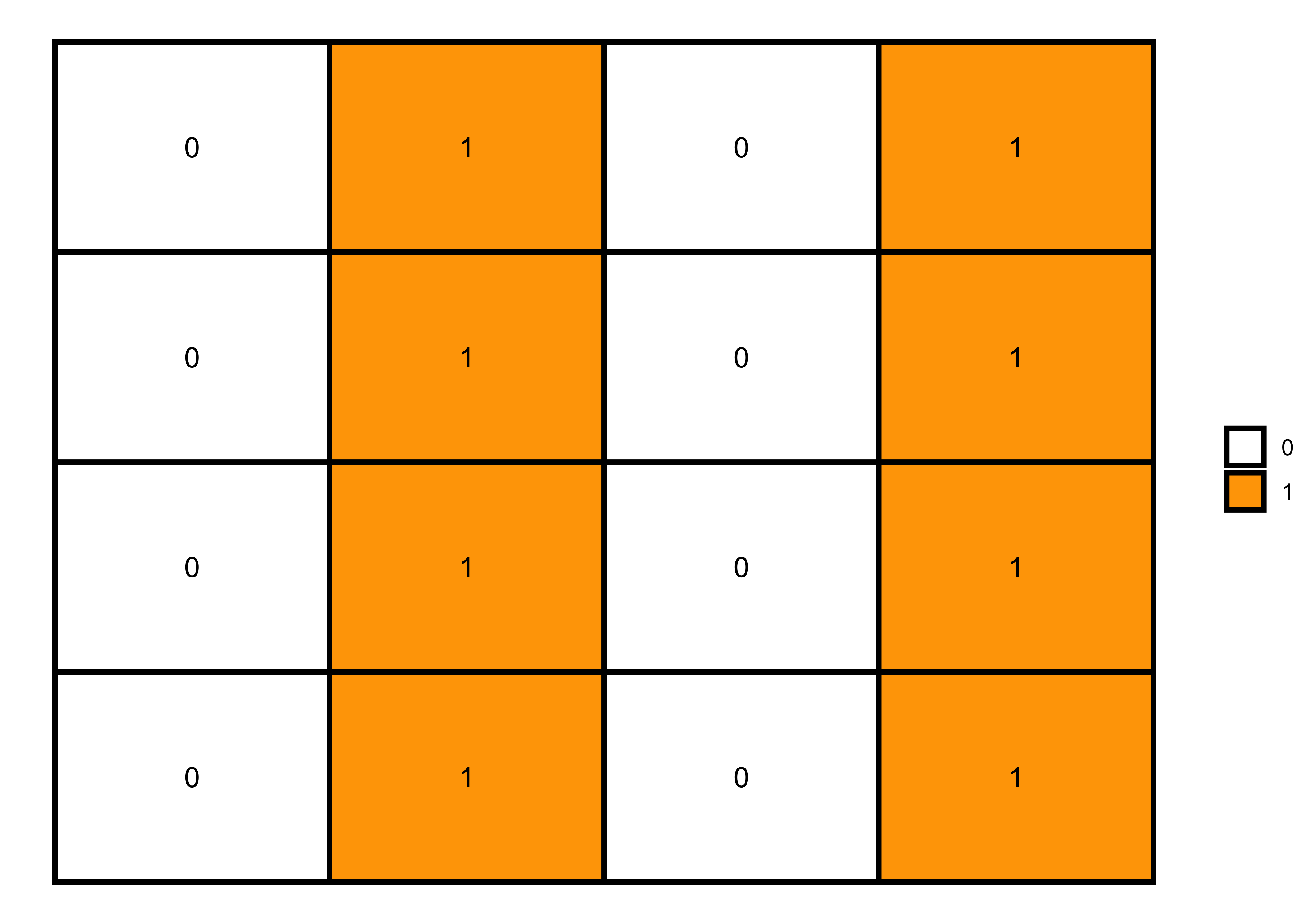
Then, I’ll add the ones to generate some patterns.
Each column with a distinct number
# 4x4 matrix with distinct columns
m <- matrix(0:3, nrow = 4, ncol = 4, byrow=TRUE)

# matrix visualization
melt(m) |>
  ggplot(aes(x = Var2, y = Var1, fill = factor(value), label = value)) +
  geom_tile(color = "black", size = 1) +
  scale_fill_brewer(palette = "Accent") +
  geom_text() +
  labs(fill = NULL) +
theme_void() 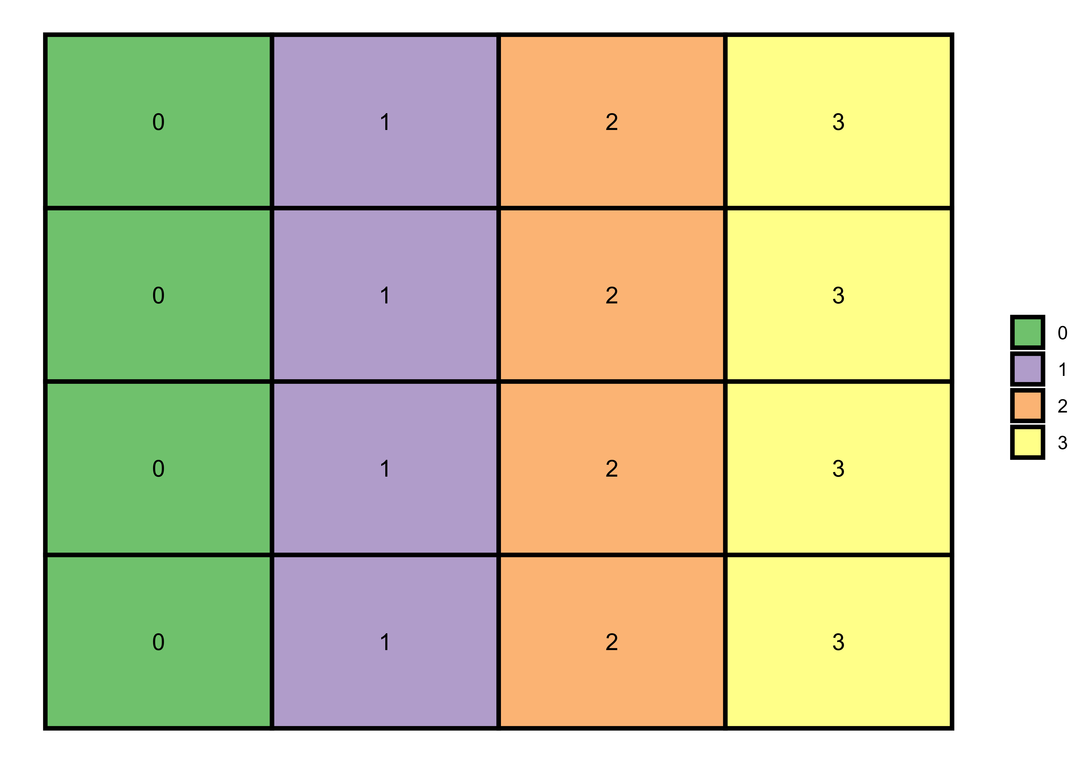
By using the same method, I’ll now generate a random pattern. Hint: If we increase the range of filling values (here, 0:5) to the dimensions of a matrix, the matrix function will arrange the number randomly to fill the matrix. You can increase the range and see how the pattern changes.
Random pattern
# 4x4 matrix with randomly generated number (0:5)
m <- matrix(0:5, nrow = 4, ncol = 4, byrow=TRUE)

# matrix visualization
melt(m) |>
  ggplot(aes(x = Var2, y = Var1, fill = factor(value), label = value)) +
  geom_tile(color = "black", size = 1) +
  scale_fill_brewer(palette = "Set3") +
  geom_text() +
  labs(fill = NULL) +
theme_void() 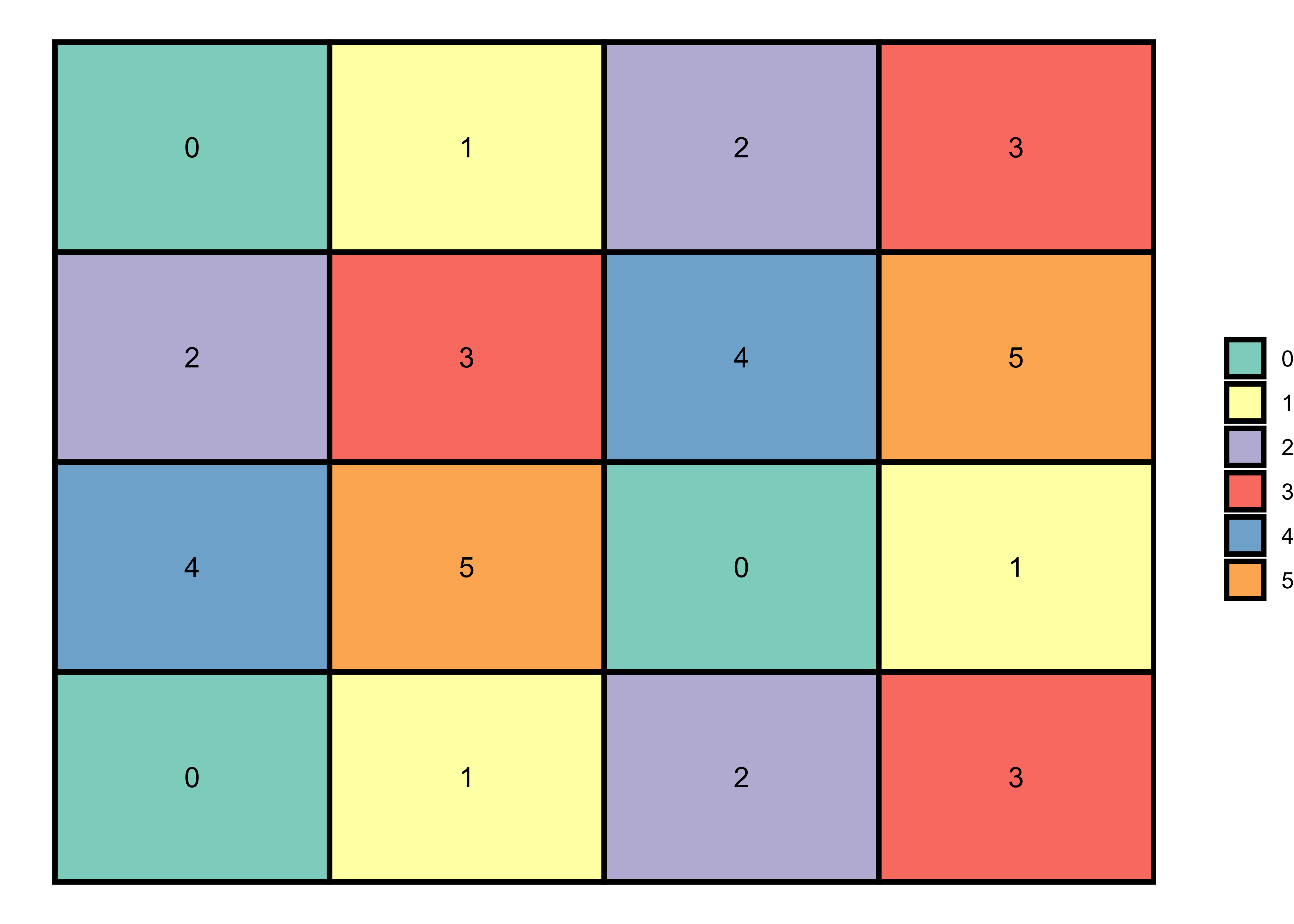
Binomial pattern
Like previous matrices, we can also generate a binomial matrix in R to denote binomial patterns, i.e., Yes or No and 0 or 1. And for this purpose, we can use rbinom function to generate 0 and 1 values in a random pattern.
Random pattern
set.seed(1)

# 6x6 matrix with randomly generated numbers (0 and 1)
m <- matrix(rbinom(36, 1, 0.3), nrow = 6)

# matrix visualization
melt(m) |>
  ggplot(aes(x = Var2, y = Var1)) +
  geom_tile(aes(fill = factor(value)), color = "black", size = 1) +
  scale_fill_manual(values = c("white", "orange")) +
  labs(fill = NULL) +
theme_void() 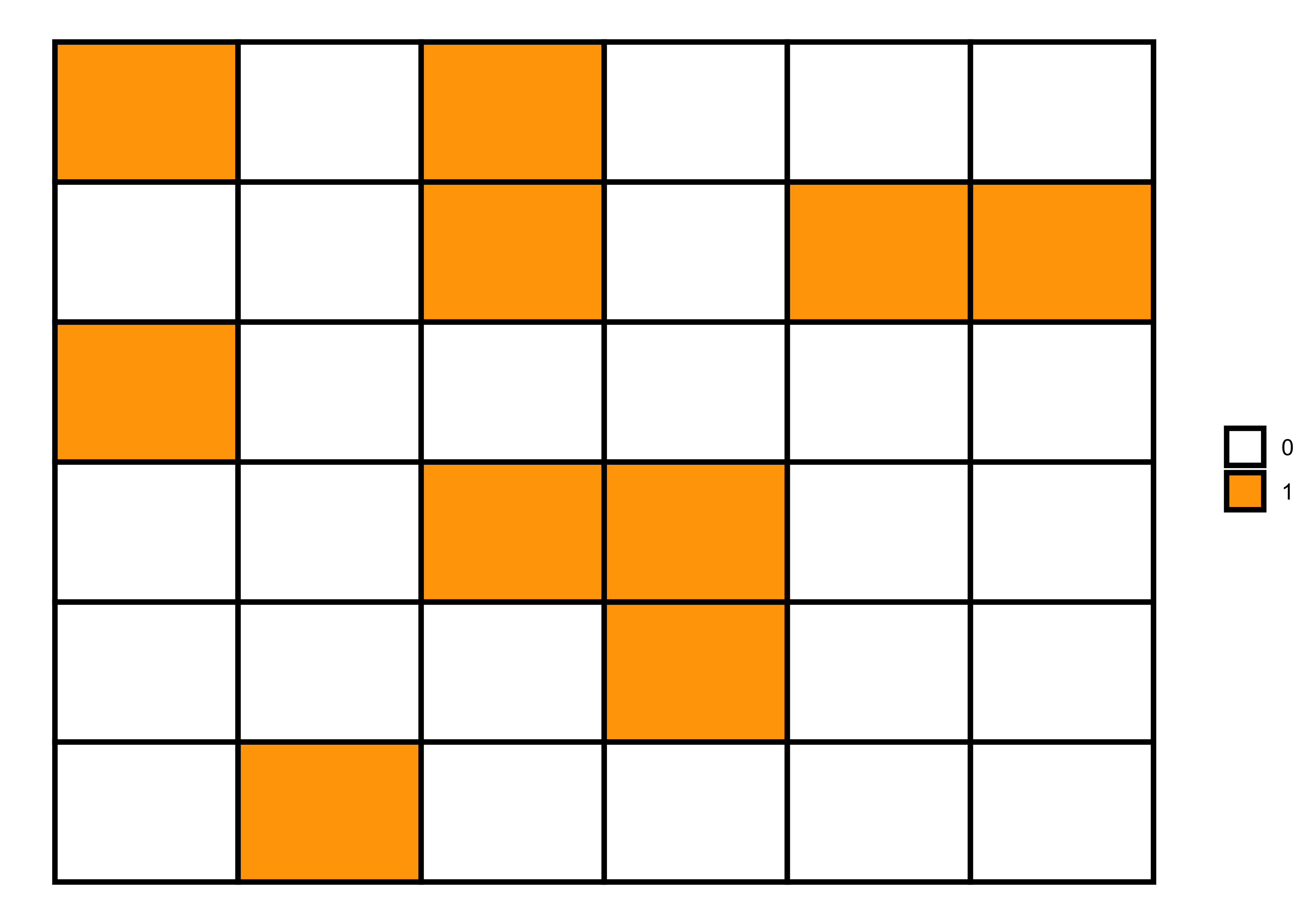
In the last matrix, I used probability (p = 0.3) to generate a random sequence of 0 and 1. However, we can also write a function to generate random patterns using different probabilities and then visualize them to see how the random pattern varies with varying probabilities.
pp <- list()

for (i in 2:7) {
m <- matrix(rbinom(36, 1, i/10), nrow = 6)

data = melt(m)

pp[[i]]  <- data |>
  ggplot(aes(x = Var2, y = Var1)) +
  geom_tile(aes(fill = factor(value)), color = "black", size = 1) +
  scale_fill_manual(values = c("white", "orange")) +
  labs(fill = NULL, subtitle = paste("p = ", i/10)) +
  theme_void() +
  theme(plot.subtitle = element_text(hjust = 0.5, face = "bold"))
}

# grid of plots
library(patchwork)

pp[[2]] + pp[[3]] + pp[[4]] + pp[[5]] + pp[[6]] + pp[[7]] + plot_layout(ncol = 3, guides = "collect")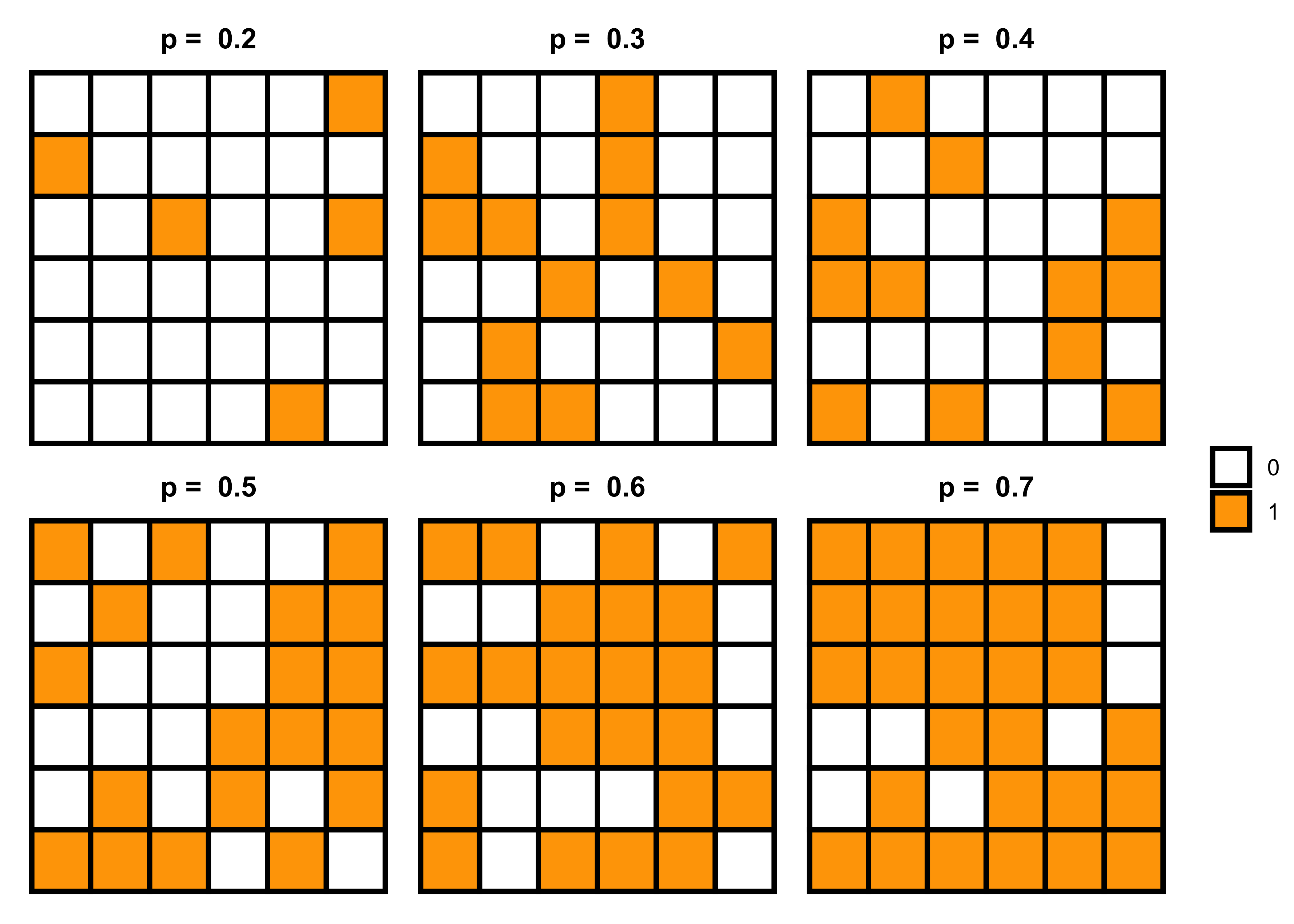
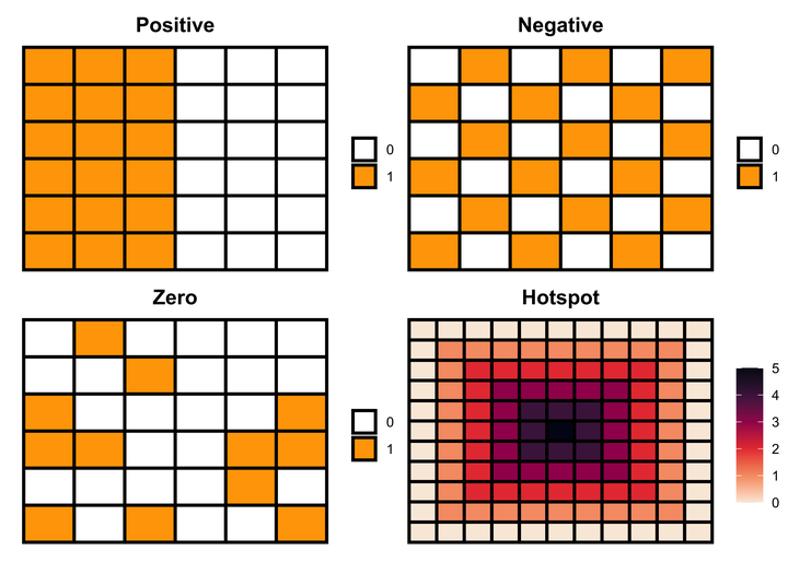
Positive spatial autocorrelation
Positive spatial autocorrelation means that geographically nearby values of a variable tend to be similar, i.e., high values tend to be located near high values and low values near low values. We can generate this pattern using the following code.
Code 1
# 6x6 matrix
m <- matrix(nrow=6, ncol = 6, byrow=TRUE)

# filling values in the matrix
m[1:6, 1L:3L] = 1 # rows 1 to 6 in columns 1 to 3 with 1
m[1:6, 4L:6L] = 0 # rows 1 to 6 in columns 4 to 6 with 0

# matrix visualization
melt(m) |>
  ggplot(aes(x = Var2, y = Var1)) +
  geom_tile(aes(fill = factor(value)), color = "black", size = 1) +
  scale_fill_manual(values = c("white", "orange")) +
  labs(fill = NULL) +
theme_void() 
Code 2
# 6x6 matrix
m <- matrix(c(1, 1, 1, 0, 0, 0), nrow=6, ncol = 6, byrow=TRUE)

# matrix visualization
melt(m) |>
  ggplot(aes(x = Var2, y = Var1)) +
  geom_tile(aes(fill = factor(value)), color = "black", size = 1) +
  scale_fill_manual(values = c("white", "orange")) +
  labs(fill = NULL) +
theme_void() 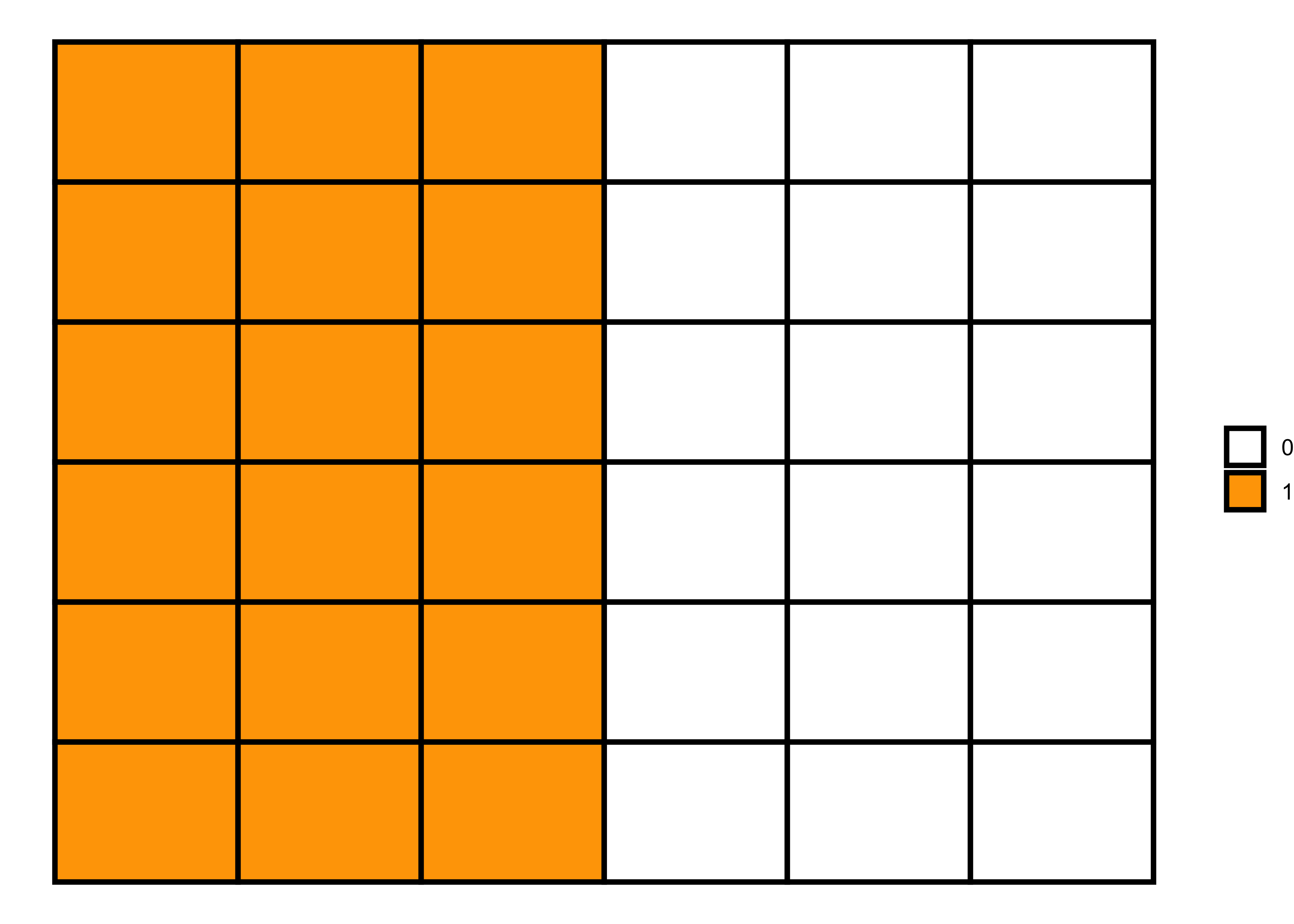
Negative spatial autocorrelation
Negative spatial autocorrelation is the opposite of positive spatial autocorrelation, i.e., when dissimilar values cluster together on a map. We can generate this pattern using the following code.
# 6x6 matrix
m <- matrix(nrow=6, ncol = 6, byrow=TRUE)

# filling values in the matrix
m[c(1, 3, 5), c(1L, 3L, 5L)] = 1
m[c(2, 4, 6), c(2L, 4L, 6L)] = 1
m[c(1, 3, 5), c(2L, 4L, 6L)] = 0
m[c(2, 4, 6), c(1L, 3L, 5L)] = 0

# matrix visualization
melt(m) |>
  ggplot(aes(x = Var2, y = Var1)) +
  geom_tile(aes(fill = factor(value)), color = "black", size = 1) +
  scale_fill_manual(values = c("white", "orange")) +
  labs(fill = NULL) +
theme_void() 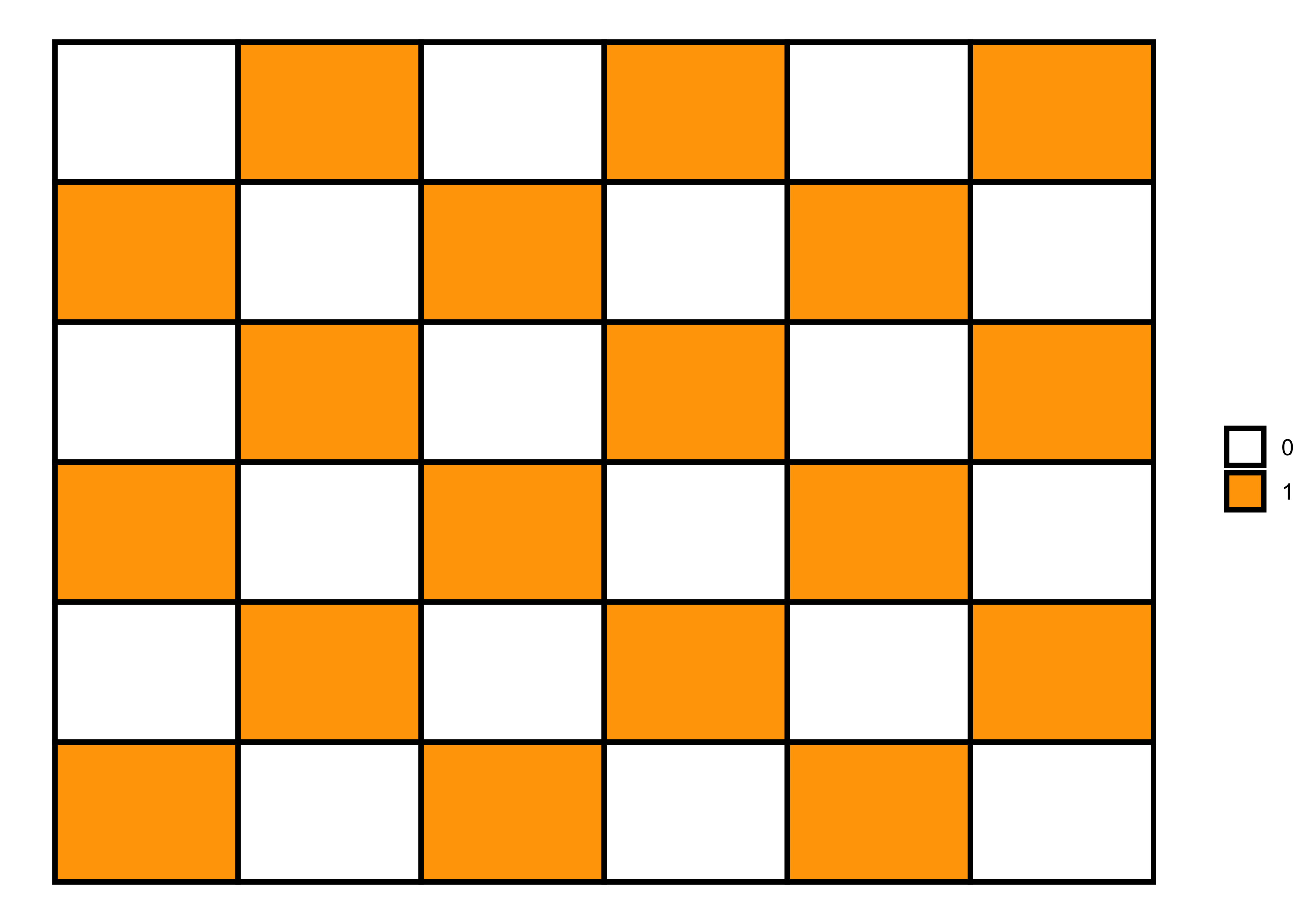
Hotspot pattern
A hotspot pattern is another positive spatial autocorrelation pattern that represents clustering. We can generate a hotspot pattern using the following code.
# 6x6 matrix
m <- matrix(nrow=11, ncol = 11, byrow=TRUE)

# filling values in the matrix
m[c(1:11), c(1L:11L)] = 0
m[c(2:10), c(2L:10L)] = 1
m[c(3:9), c(3L:9L)] = 2
m[c(4:8), c(4L:8L)] = 3
m[c(5:7), c(5L:7L)] = 4
m[c(6), c(6L)] = 5

# matrix visualization
melt(m) |>
  ggplot(aes(x = Var2, y = Var1)) +
  geom_tile(aes(fill = value), color = "black", size = 1) +
  scale_fill_viridis_c(option = "F", direction = -1) +
  labs(fill = NULL) +
theme_void() 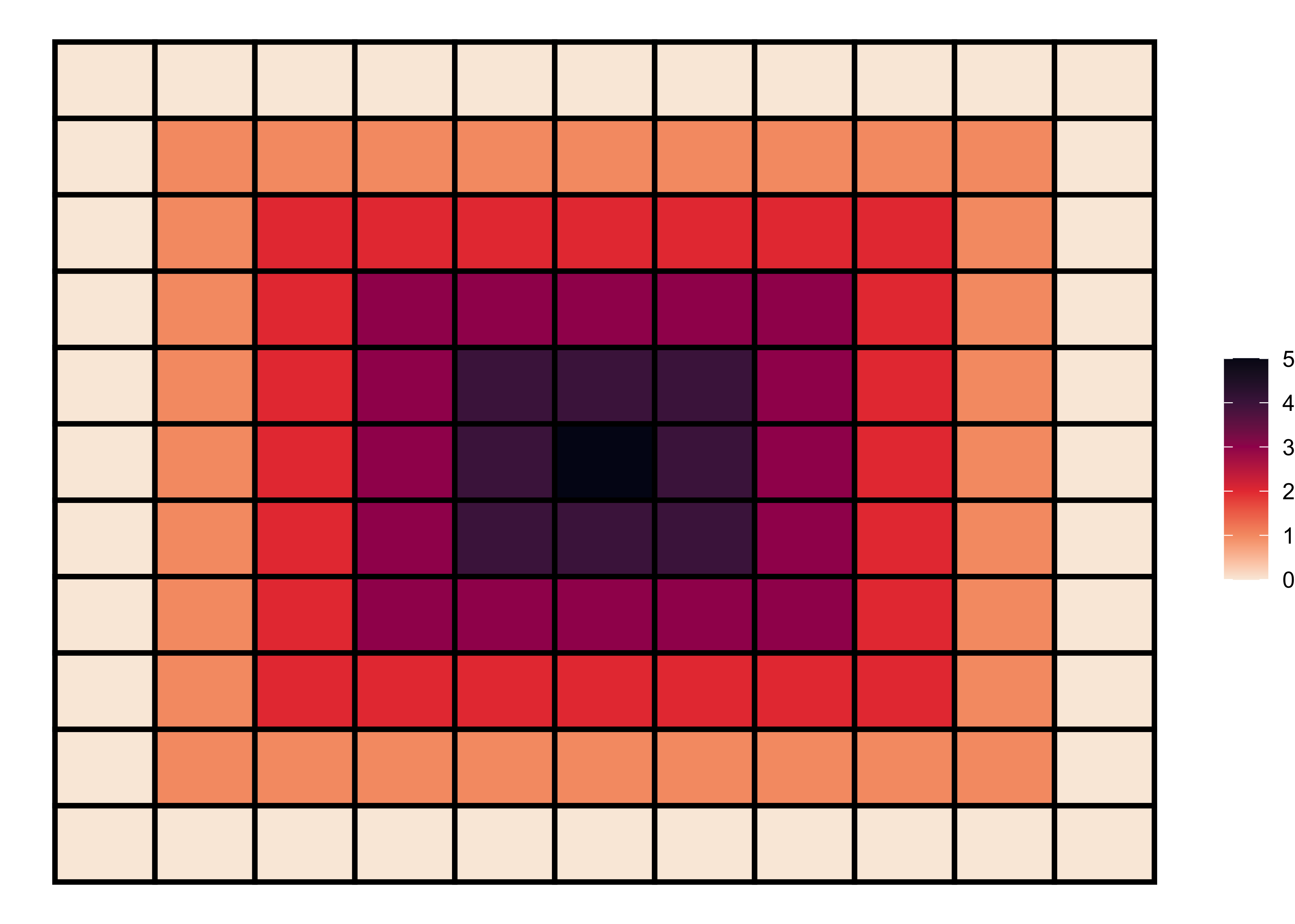
That’s it!
Feel free to reach me out if you got any questions.
Muhammad Mohsin Raza
Data Scientist
My research interests include disease modeling in space and time, climate change, GIS and Remote Sensing and Data Science in Agriculture.