Exploring Global Aridity Changes: A Data Science Adventure
Have you ever wondered how our planet’s climate is changing over time? The impacts of climate change are felt in various ways, and one important aspect is aridity. Aridity, which refers to the dryness of an environment, has significant implications for ecosystems, water availability, and biodiversity. In this data science blog, we will embark on a journey to visualize and understand changes in aridity using R and a fascinating dataset that spans from 1950 to 2100.
Unveiling the Data
Our adventure begins with data acquisition. We’ve sourced a comprehensive dataset of global bioclimatic indicators from climate projections. These indicators provide us with valuable insights into various climatic factors, including aridity. You can access the dataset from the Copernicus Climate Change Service (C3S) at the following link: Global Bioclimatic Indicators.
The dataset contains aridity data for different years, allowing us to explore how aridity has evolved over time. We’ll use the powerful capabilities of R and several libraries, including tidyverse, sf, terra and gganimate, to analyze and visualize this dataset.
Loading and Preparing the Data
Let’s start by loading the necessary libraries and importing the aridity raster data. We’ll also perform some initial exploratory data analysis (EDA) to better understand the data structure and characteristics. The code snippet below demonstrates this process:
# Load libraries
library(tidyverse)
library(sf)
library(gganimate)
library(raster)
library(terra)
library(RColorBrewer)

# Load the aridity raster data
aridity_rcp85 <- rast("dataset-sis-biodiversity-cmip5-global-8a76744d-4fd0-407f-b272-1cfcc91c4aef/aridity_annual-mean_gfdl-esm2m_rcp85_r1i1p1_1950-2100_v1.0.nc")

# Rename raster layers using their corresponding time stamps
names(aridity_rcp85) <- time(aridity_rcp85)

# EDA: Basic visualization
layer_number <- 75
my_palette <- colorRampPalette(brewer.pal(11, "RdYlBu"))

# Plot the raster layer using a custom palette
plot(aridity_rcp85[[layer_number]],
     col = rev(my_palette(100)),
     main = paste("Aridity - Layer", layer_number),
     legend.args = list(text = "Aridity Index",
                        side = 1,
                        font = 2,
                        line = 2.5,
                        cex = 0.8))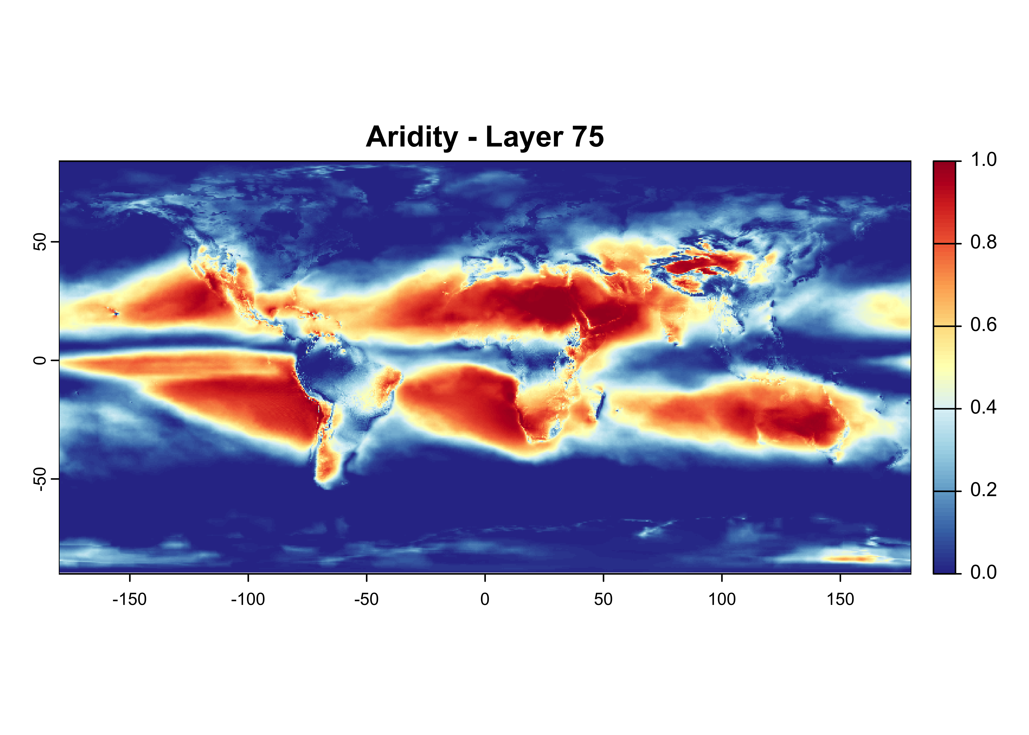
Animated Insights
One of the most compelling ways to convey changes over time is through animation. By visualizing aridity data as an animation, we can effectively showcase its evolution on a global scale. To achieve this, we’ll employ the gganimate library along with geographic information from the Natural Earth dataset. The animation will elegantly illustrate how aridity varies across different years.
Note: For the sake of space, I’ll just use first 10 rasters in the stack for animation.
# Load necessary libraries
library(gganimate)
library(rnaturalearth)
# Custom fonts
library(showtext)
font_add_google("Prata", regular.wt = 400)
showtext_auto()
# Download global coastline data from naturalearth
countries <- ne_countries(scale = 110, returnclass = c("sf"))
# Define the output directory and animation file
output_dir <- "Animation/"
animation_file <- "aridity_animation.gif"
# Create the output directory if it doesn't exist
if (!dir.exists(output_dir)) {
dir.create(output_dir)
}
# Convert raster data to a dataframe
g_df <- aridity_rcp85[[1:50]] %>% # first 10 rasters only
as.data.frame(xy = TRUE) %>%
pivot_longer(!c(x, y)) %>%
filter(!is.na(value)) %>%
mutate(name = ymd(name),
Year = year(name))
# Get unique years
Years <- unique(g_df$Year)
# Loop over each unique year
purrr::map(Years, ~{
# Filter data for the current year
year_data <- g_df %>% filter(Year == .x)
# Formulate the graphing element
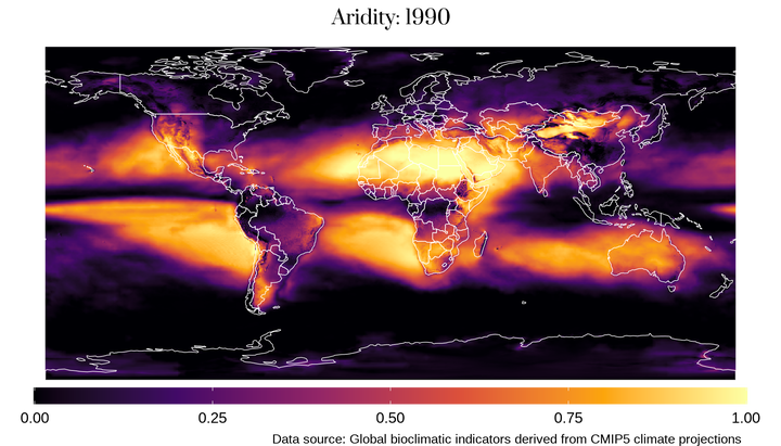
world_map <- ggplot() +
theme_void() +
geom_raster(data = year_data, aes(x = x, y = y, fill = value, group = name), color = NA) +
scale_fill_viridis_c(option = "B") +
geom_sf(data = countries, color = 'white', linetype = 'solid', fill = NA, size = 0.2) +
theme(
plot.title = element_text(family = "Prata", size = 40, hjust = 0.5),
plot.subtitle = element_text(hjust = 0.5, size = 16),
plot.caption = element_text(color = "black", size = 26, hjust = 0.9),
legend.position = "bottom",
legend.text = element_text(size = 30),
legend.box.spacing = unit(-12, "pt")
) +
labs(title = paste("Aridity:", round(.x)),
caption = "Data source: Global bioclimatic indicators derived from CMIP5 climate projections",
fill = NULL) +
guides(
fill = guide_colourbar(
direction = 'horizontal',
title.position='top',
title.hjust=0.5,
ticks.colour='#f5f5f2',
barwidth = 32,
barheight = 0.75
)
)
# Define the file path for the PNG image
file_path <- file.path(output_dir, sprintf("aridity_%d.png", .x))
# Save the plot as a PNG image
ggsave(file_path, world_map, dpi = 300, width = 7, height = 4)
})## [[1]]
## [1] "Animation//aridity_1950.png"
##
## [[2]]
## [1] "Animation//aridity_1951.png"
##
## [[3]]
## [1] "Animation//aridity_1952.png"
##
## [[4]]
## [1] "Animation//aridity_1953.png"
##
## [[5]]
## [1] "Animation//aridity_1954.png"
##
## [[6]]
## [1] "Animation//aridity_1955.png"
##
## [[7]]
## [1] "Animation//aridity_1956.png"
##
## [[8]]
## [1] "Animation//aridity_1957.png"
##
## [[9]]
## [1] "Animation//aridity_1958.png"
##
## [[10]]
## [1] "Animation//aridity_1959.png"
##
## [[11]]
## [1] "Animation//aridity_1960.png"
##
## [[12]]
## [1] "Animation//aridity_1961.png"
##
## [[13]]
## [1] "Animation//aridity_1962.png"
##
## [[14]]
## [1] "Animation//aridity_1963.png"
##
## [[15]]
## [1] "Animation//aridity_1964.png"
##
## [[16]]
## [1] "Animation//aridity_1965.png"
##
## [[17]]
## [1] "Animation//aridity_1966.png"
##
## [[18]]
## [1] "Animation//aridity_1967.png"
##
## [[19]]
## [1] "Animation//aridity_1968.png"
##
## [[20]]
## [1] "Animation//aridity_1969.png"
##
## [[21]]
## [1] "Animation//aridity_1970.png"
##
## [[22]]
## [1] "Animation//aridity_1971.png"
##
## [[23]]
## [1] "Animation//aridity_1972.png"
##
## [[24]]
## [1] "Animation//aridity_1973.png"
##
## [[25]]
## [1] "Animation//aridity_1974.png"
##
## [[26]]
## [1] "Animation//aridity_1975.png"
##
## [[27]]
## [1] "Animation//aridity_1976.png"
##
## [[28]]
## [1] "Animation//aridity_1977.png"
##
## [[29]]
## [1] "Animation//aridity_1978.png"
##
## [[30]]
## [1] "Animation//aridity_1979.png"
##
## [[31]]
## [1] "Animation//aridity_1980.png"
##
## [[32]]
## [1] "Animation//aridity_1981.png"
##
## [[33]]
## [1] "Animation//aridity_1982.png"
##
## [[34]]
## [1] "Animation//aridity_1983.png"
##
## [[35]]
## [1] "Animation//aridity_1984.png"
##
## [[36]]
## [1] "Animation//aridity_1985.png"
##
## [[37]]
## [1] "Animation//aridity_1986.png"
##
## [[38]]
## [1] "Animation//aridity_1987.png"
##
## [[39]]
## [1] "Animation//aridity_1988.png"
##
## [[40]]
## [1] "Animation//aridity_1989.png"
##
## [[41]]
## [1] "Animation//aridity_1990.png"
##
## [[42]]
## [1] "Animation//aridity_1991.png"
##
## [[43]]
## [1] "Animation//aridity_1992.png"
##
## [[44]]
## [1] "Animation//aridity_1993.png"
##
## [[45]]
## [1] "Animation//aridity_1994.png"
##
## [[46]]
## [1] "Animation//aridity_1995.png"
##
## [[47]]
## [1] "Animation//aridity_1996.png"
##
## [[48]]
## [1] "Animation//aridity_1997.png"
##
## [[49]]
## [1] "Animation//aridity_1998.png"
##
## [[50]]
## [1] "Animation//aridity_1999.png"# Combine PNG images into a GIF animation
# Get the list of PNG files in the directory
image_files <- list.files(output_dir, pattern = "*.png", full.names = TRUE)
# Read the images
library(magick)
images <- lapply(image_files, image_read)
# Set the frames per second (fps) for the animation
fps <- 5
# Create the animation by setting the duration for each frame
animation <- image_animate(image_join(images), fps = fps)
# Save the animation as a GIF file
animation_file <- "aridity_animation.gif"
image_write(animation, animation_file)
# animation
animation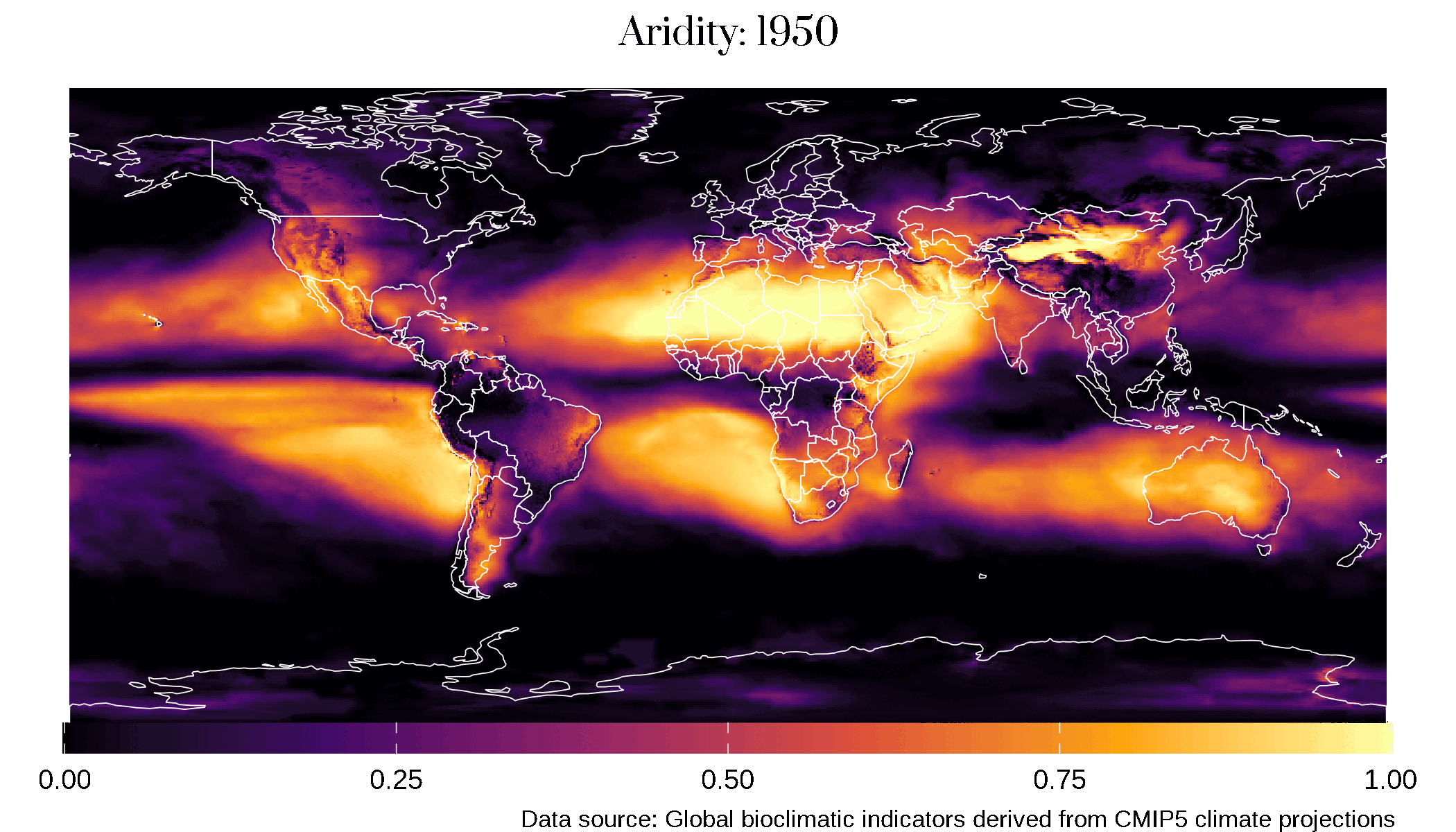
Conclusion
Through this data science adventure, we’ve explored the captivating realm of global aridity changes. With the help of R and a rich dataset, we’ve visualized the evolution of aridity over time, providing an engaging and informative animation. This journey reminds us of the importance of understanding climate change’s impact on our environment and the critical role that data science plays in uncovering such insights. As we continue to innovate and explore, we can use data-driven approaches to shape a more sustainable future for our planet.
That’s it!
Feel free to reach me out if you got any questions.
Muhammad Mohsin Raza
Data Scientist
My research interests include disease modeling in space and time, climate change, GIS and Remote Sensing and Data Science in Agriculture.