Bootstrapping Regression Coefficients in grouped data using Tidymodels

This is the continuation of my previous post where I demonstrated Bootstrapping correlation coefficients in R using the tidymodels workflow. In this blog post, I’ll show how we can obtain and visualize bootstrapped estimates of simple linear regression for nested (grouped) data in R using the tidymodels package.
Load libraries
library(tidyverse)
library(tidymodels)
library(rstatix)
library(ggpubr)
Load data
Again, I’ll use the iris data set in this post to keep things simple.
data(iris)Simple Linear Regression
As we have seen in the previous post that sepal and petal lengths are positively related to each other. This means that if sepal length increases, petal length also increases, despite the fact of iris species.
iris %>%
  ggplot(aes(x = Sepal.Length, y = Petal.Length)) +
  geom_point(colour = "orange", alpha = 0.6) +
  geom_smooth(method = "lm") +
  stat_cor(method = "pearson", cor.coef.name = "r", p.accuracy = 0.001, r.accuracy = 0.01) +
  labs(x = "Sepal length", y = "Petal length") +
  theme_bw()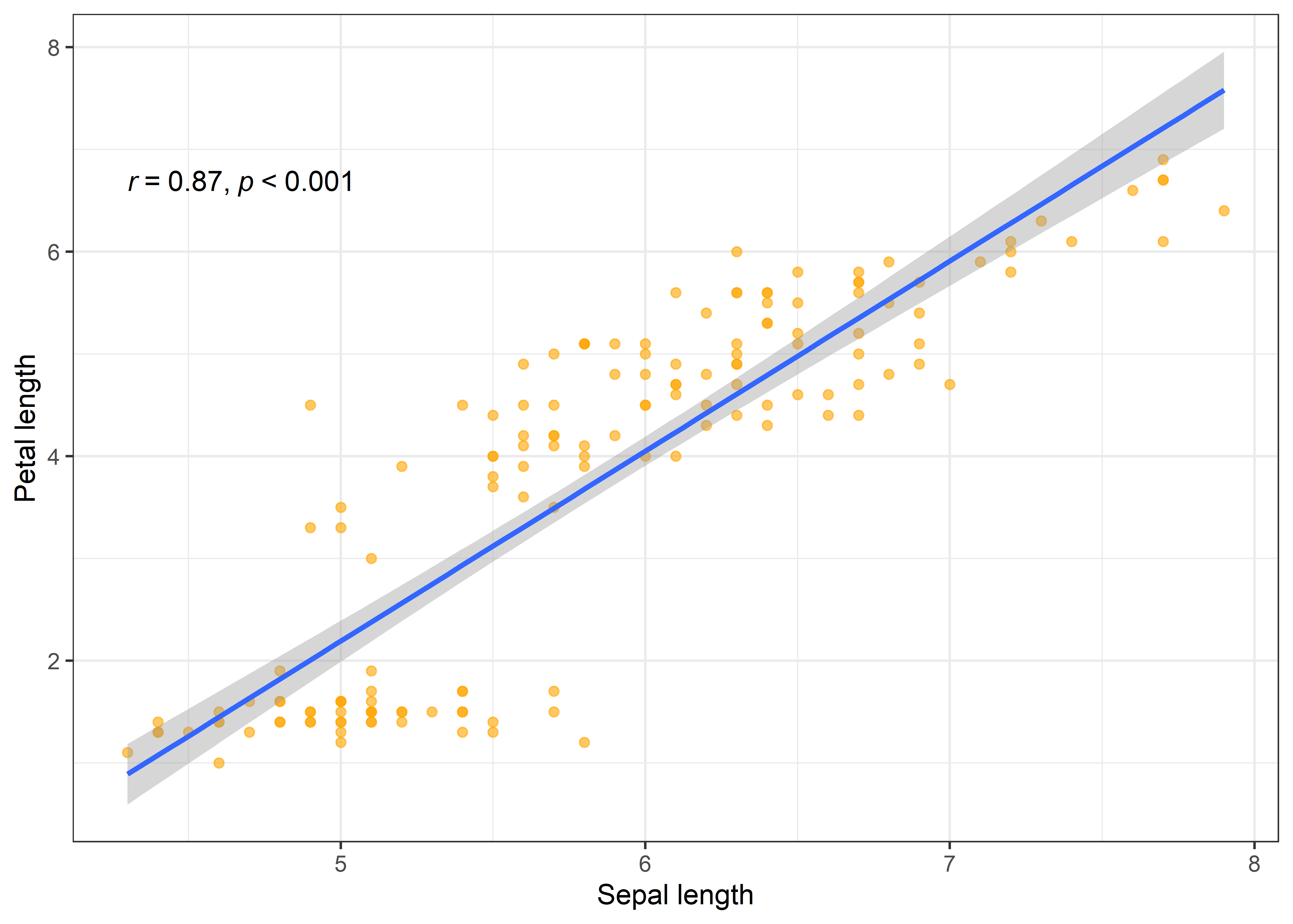
Now, I’ll run the regression analysis between sepal and petal length for each iris species separately. First, I’ll nest the species and then use purrr::map() inside mutate function to run the regression analysis in nest'ed data. This is the speciality of thetidymodels` workflow to design complex analyses in one sequence.
Regression analysis by groups (Species)
point <- iris %>%
  nest(data = -c(Species)) %>%
  mutate(model = map(data, ~lm(Sepal.Length ~ Petal.Length, data = .x)),
         coefs = map(model, tidy)) %>%
  unnest(coefs) %>%
  select(-data, -model)

point
## # A tibble: 6 × 6
## Species term estimate std.error statistic p.value
## <fct> <chr> <dbl> <dbl> <dbl> <dbl>
## 1 setosa (Intercept) 4.21 0.416 10.1 1.61e-13
## 2 setosa Petal.Length 0.542 0.282 1.92 6.07e- 2
## 3 versicolor (Intercept) 2.41 0.446 5.39 2.08e- 6
## 4 versicolor Petal.Length 0.828 0.104 7.95 2.59e-10
## 5 virginica (Intercept) 1.06 0.467 2.27 2.77e- 2
## 6 virginica Petal.Length 0.996 0.0837 11.9 6.30e-16Here, the term indicates Intercept and slope coefficients of Petal length and in each iris species. The estimates can be found in the estimate column. The tidy format provides results in tibble format that can be easily used for further wrangling and data visualizations using ggplot2 package and related libraries.
iris %>%
  ggplot(aes(x = Sepal.Length, y = Petal.Length, color = Species)) +
  geom_point() +
  geom_smooth(method = "lm") +
  stat_cor(method = "pearson", cor.coef.name = "r", p.accuracy = 0.001, r.accuracy = 0.01) +
  labs(x = "Sepal length", y = "Petal length") +
  theme_test()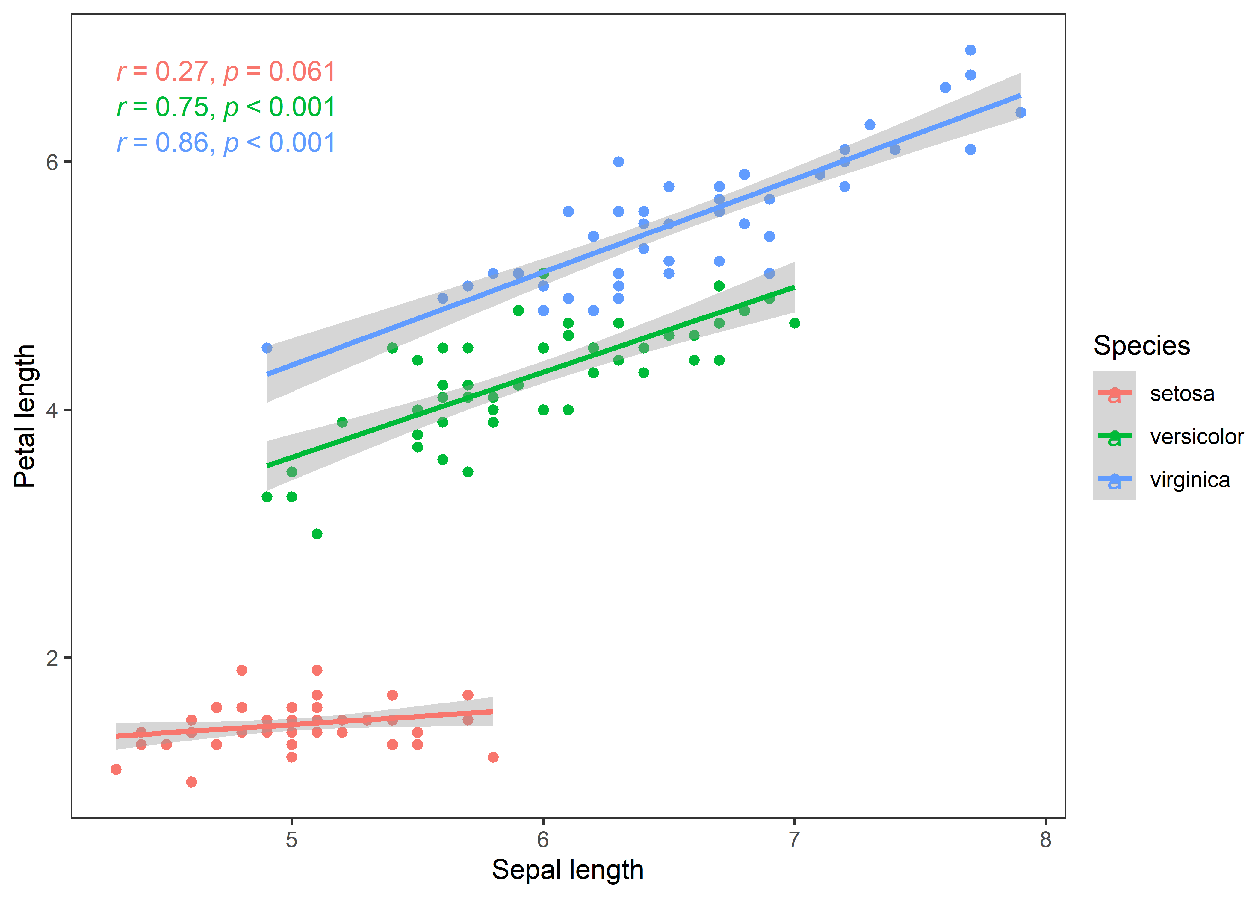
The curves depict a clear story of the associations in all iris species. Now, I’ll bootstrap regression (slope) estimates to test how robust are the beta coefficients of regression between sepal and petal length in iris species.
Bootsrapped Regression
I’ll nest the data by species as we want bootstrapped estimates for all iris species. After that, I’ll define the bootstraps for each nested tibble using the bootstraps function inside purrr::map(). Then I’ll perform the regression analysis on each bootstrapped tibble (splits). Finally, I’ll unnest the tidied data frames so we can see the results in a flat tibble.
boot_reg <- iris %>%
  nest(data = -c(Species)) %>% # grouping the species
  mutate(boots = map(data, ~bootstraps(.x, times = 1000, apparent = FALSE))) %>% # defining bootstraps
  unnest(boots) %>% # un-nesting bootstrapped data lists
  mutate(model = map(splits, ~lm(Sepal.Length ~ Petal.Length, data = analysis((.)))),
         coefs = map(model, tidy)) # performing regression

reg <- boot_reg %>%
  unnest(coefs) %>% # unnesting tidied data frames
  select(-data, -splits, -id, -model)

reg
## # A tibble: 6,000 × 6
## Species term estimate std.error statistic p.value
## <fct> <chr> <dbl> <dbl> <dbl> <dbl>
## 1 setosa (Intercept) 4.15 0.393 10.6 3.99e-14
## 2 setosa Petal.Length 0.580 0.262 2.21 3.19e- 2
## 3 setosa (Intercept) 3.80 0.491 7.73 5.61e-10
## 4 setosa Petal.Length 0.862 0.341 2.53 1.49e- 2
## 5 setosa (Intercept) 4.99 0.394 12.7 6.34e-17
## 6 setosa Petal.Length 0.0558 0.267 0.209 8.36e- 1
## 7 setosa (Intercept) 4.33 0.257 16.8 8.66e-22
## 8 setosa Petal.Length 0.486 0.174 2.80 7.38e- 3
## 9 setosa (Intercept) 4.72 0.436 10.8 1.76e-14
## 10 setosa Petal.Length 0.180 0.297 0.604 5.49e- 1
## # … with 5,990 more rows
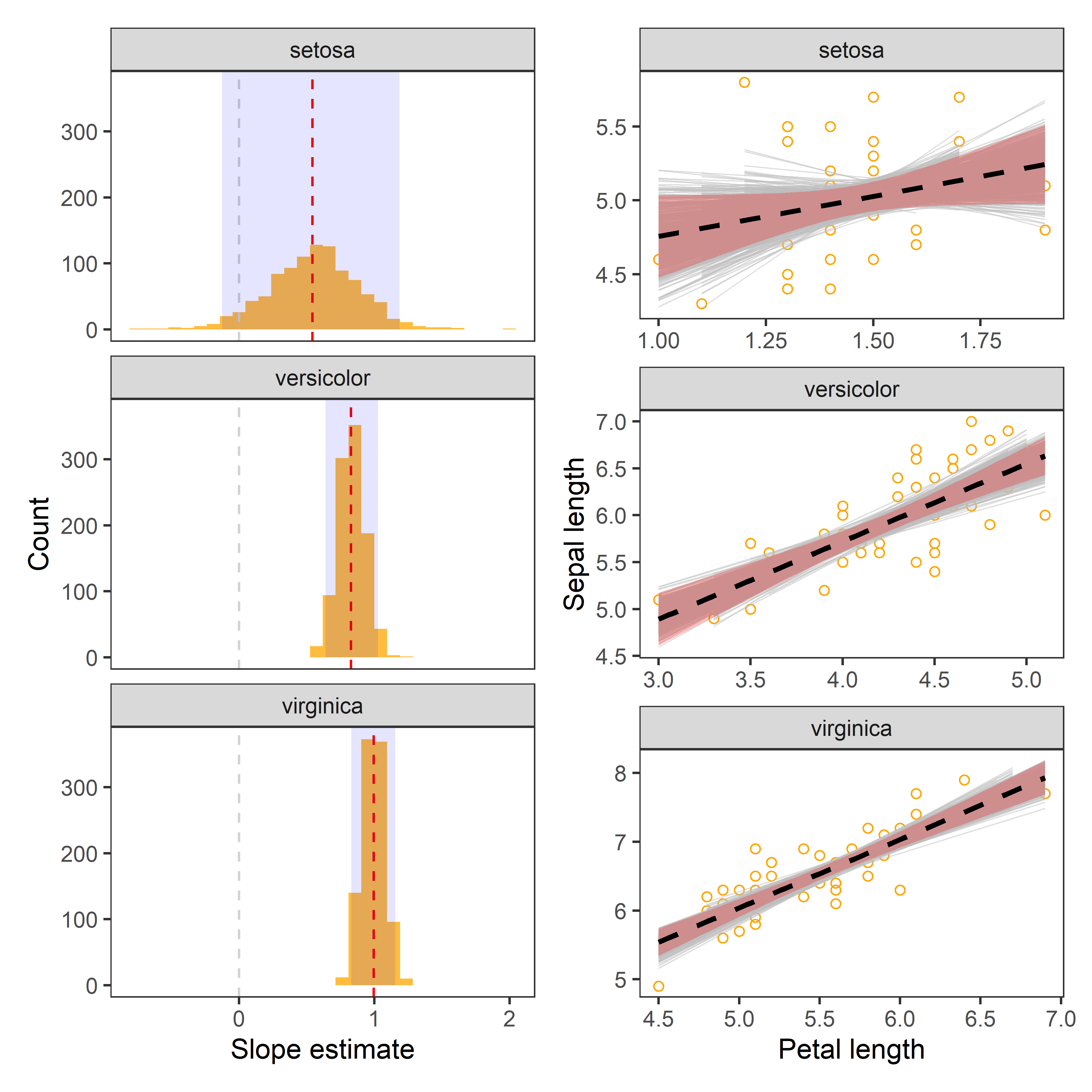
## # ℹ Use `print(n = ...)` to see more rowsVisualizing the bootstrapped estimates
One of the simple ways to visualize bootstrapped estimates is to draw the distributions along with observed estimates, i.e., estimates from raw data and confidence intervals, e.g. 95%.
Distributions
# confidence interval
CI <- reg %>%
  filter(term == "Petal.Length") %>%
  group_by(Species) %>%
        summarise(lwr_CI = quantile(estimate, 0.025),
                  .estimate = median(estimate),
                  upr_CI = quantile(estimate, 0.975))

reg %>%
  filter(term == "Petal.Length") %>%
  ggplot(aes(x = estimate)) +
  geom_histogram(bins = 30, fill = "orange", alpha = 0.75) +
  geom_vline(aes(xintercept = 0), col = "lightgrey", lty = 2, size = 0.5) +
  geom_vline(aes(xintercept = estimate), data = point %>% filter(term == "Petal.Length"), lty = 2, col = "red") +
  geom_rect(aes(x = .estimate, xmin = lwr_CI, xmax = upr_CI, ymin = 0, ymax = Inf), data = CI, alpha = 0.1, fill = "blue") +
  labs(x = "Slope estimate", y = "Count") +
  theme_test() +
  facet_wrap(~Species)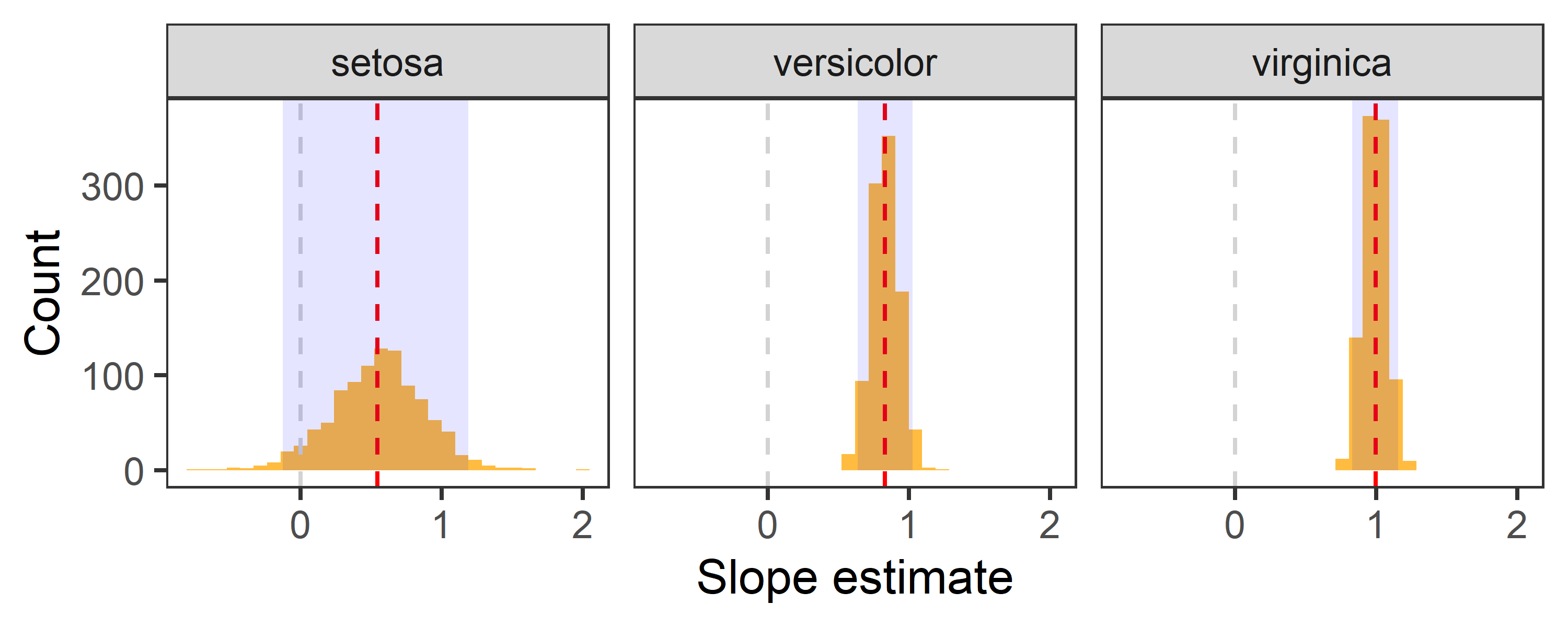
- Red dashed line indicates the point estimate of regression slopes.
- Grey dashed line indicates 0, i.e., no change.
- The shaded area indicates 95% confidence interval.
Possible model fits
Now, I’ll use augment function to extract fitted data from each bootstrapped split in each iris species. We can then use this data to visualize the uncertainty in the fitted curve.
boot_aug <-
  boot_reg %>%
  mutate(augmented = map(model, augment)) %>%
  unnest(augmented)

boot_aug
## # A tibble: 150,000 × 14
## Species data splits id model coefs Sepal…¹ Petal…² .fitted
## <fct> <list> <list> <chr> <lis> <list> <dbl> <dbl> <dbl>
## 1 setosa <tibble> <split [50/19]> Boot… <lm> <tibble> 4.8 1.6 5.08
## 2 setosa <tibble> <split [50/19]> Boot… <lm> <tibble> 5.2 1.5 5.02
## 3 setosa <tibble> <split [50/19]> Boot… <lm> <tibble> 5.1 1.7 5.14
## 4 setosa <tibble> <split [50/19]> Boot… <lm> <tibble> 5 1.4 4.96
## 5 setosa <tibble> <split [50/19]> Boot… <lm> <tibble> 5.2 1.5 5.02
## 6 setosa <tibble> <split [50/19]> Boot… <lm> <tibble> 5 1.6 5.08
## 7 setosa <tibble> <split [50/19]> Boot… <lm> <tibble> 4.5 1.3 4.91
## 8 setosa <tibble> <split [50/19]> Boot… <lm> <tibble> 4.8 1.6 5.08
## 9 setosa <tibble> <split [50/19]> Boot… <lm> <tibble> 5.4 1.7 5.14
## 10 setosa <tibble> <split [50/19]> Boot… <lm> <tibble> 5.4 1.5 5.02
## # … with 149,990 more rows, 5 more variables: .resid <dbl>, .hat <dbl>,
## # .sigma <dbl>, .cooksd <dbl>, .std.resid <dbl>, and abbreviated variable
## # names ¹Sepal.Length, ²Petal.Length
## # ℹ Use `print(n = ...)` to see more rows, and `colnames()` to see all variable namesNote: See the number of rows in the extracted data. This is the data of 1000 bootstrapped fits.
Uncertainty in Fitted curve
boot_aug %>%
  ggplot(aes(x = Petal.Length, y = Sepal.Length)) +
  geom_point(colour = "orange", alpha = 0.5, shape = 1) +
  geom_line(aes(y = .fitted, group = id), col = "grey", alpha = 0.5, size = 0.25) +
  geom_smooth(aes(x = Petal.Length, y = Sepal.Length), data = iris, method = "lm",colour = "black", linetype = "dashed", fill = "red", alpha = 0.25) +
  labs(x = "Petal length", y = "Sepal length") +
  facet_wrap(~ Species, scales = "free") +
  theme_test()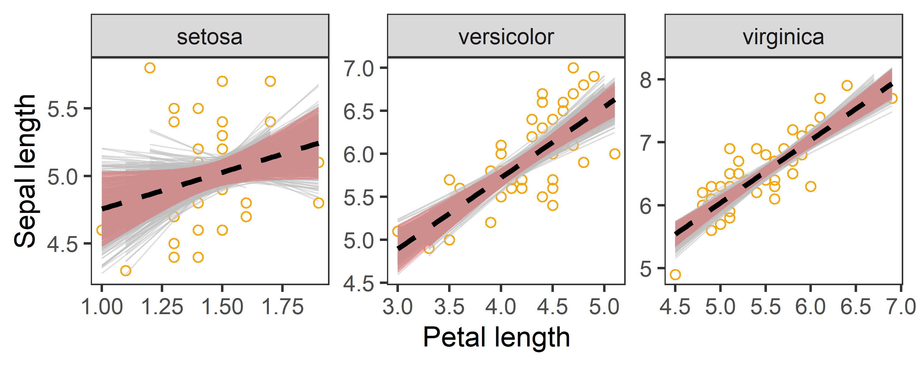
In the above charts:
- Dashed line represents the observed slope of regression between Petal and Sepal length.
- Shaded red area represents 95% confidence interval for the observed slope.
- Grey lines are
1000bootstrapped fits.
The chart indicates that our estimates of regression coefficients are robust.
That’s it!
Feel free to reach me out if you got any questions.
Muhammad Mohsin Raza
Data Scientist
My research interests include disease modeling in space and time, climate change, GIS and Remote Sensing and Data Science in Agriculture.