Bootstrapping Correlation Coefficients in grouped data using Tidymodels
In this blog post, I ll show that how we can obtain and visualize bootstrapped estimates of simple linear correlation between two variables.
Load libraries
library(tidyverse)
library(tidymodels)
library(rstatix)
library(ggpubr)
Load data
I’ll use the iris data set in this post for the demonstration of bootstrapped correlation coefficients.
data(iris)
head(iris)
## Sepal.Length Sepal.Width Petal.Length Petal.Width Species
## 1 5.1 3.5 1.4 0.2 setosa
## 2 4.9 3.0 1.4 0.2 setosa
## 3 4.7 3.2 1.3 0.2 setosa
## 4 4.6 3.1 1.5 0.2 setosa
## 5 5.0 3.6 1.4 0.2 setosa
## 6 5.4 3.9 1.7 0.4 setosaSimple correlation
At first, lets see how the sepal and petal lengths are associated with each other in the iris data set.
iris %>%
  ggplot(aes(x = Sepal.Length, y = Petal.Length)) +
  geom_point(colour = "orange", alpha = 0.6) +
  geom_smooth() +
  stat_cor(method = "pearson", cor.coef.name = "r", p.accuracy = 0.001, r.accuracy = 0.01) +
  labs(x = "Sepal length", y = "Petal length") +
  theme_bw()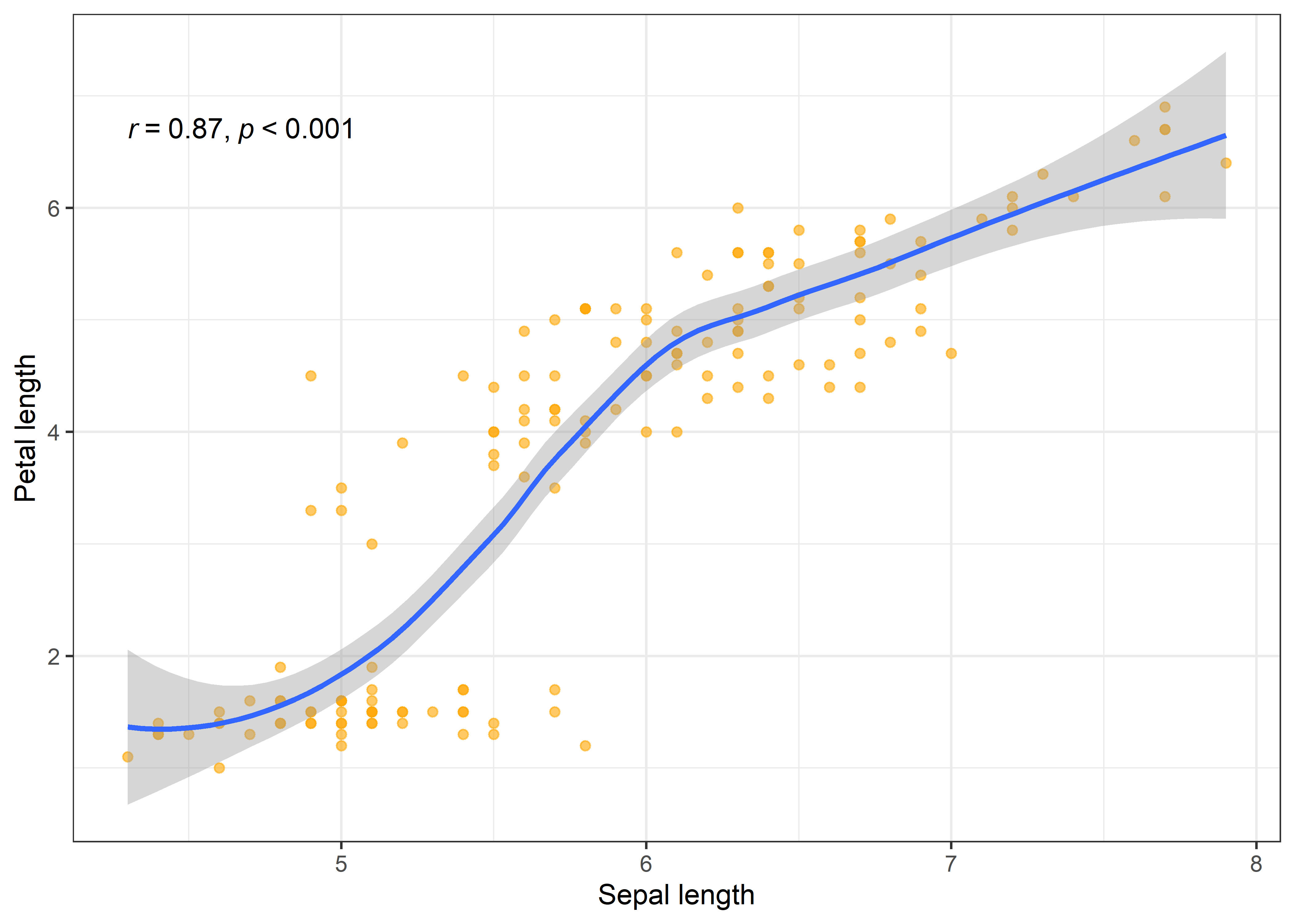
The scatter plot clearly indicates a significant positive correlation between the sepal and petal length of iris flowers. Often we are interested in the correlation between variables but in separate groups of data. For instance, what if we want to look at the association between sepal and petal length in each iris species? We can easily do that in R using the group_by function in dplyr package of R and then estimating the correlation between variables using the cor_test function of rstatix package.
Correlation by groups (Species)
point <- iris %>%
  group_by(Species) %>%
  cor_test(Sepal.Length, Petal.Length, method = "pearson")

point
## # A tibble: 3 x 9
## Species var1 var2 cor statistic p conf.low conf.high method
## <fct> <chr> <chr> <dbl> <dbl> <dbl> <dbl> <dbl> <chr>
## 1 setosa Sepal.L~ Petal.~ 0.27 1.92 6.07e- 2 -0.0121 0.508 Pears~
## 2 versicolor Sepal.L~ Petal.~ 0.75 7.95 2.59e-10 0.602 0.853 Pears~
## 3 virginica Sepal.L~ Petal.~ 0.86 11.9 6.3 e-16 0.771 0.921 Pears~As we can see that now we got correlation coefficient values cor for each iris species. The results indicates that the relationship between sepal and petal length is stronger in virginica and versicolor species than setosa. Let’s visualize these relationships.
iris %>%
  ggplot(aes(x = Sepal.Length, y = Petal.Length, color = Species)) +
  geom_point() +
  geom_smooth() +
  stat_cor(method = "pearson", cor.coef.name = "r", p.accuracy = 0.001, r.accuracy = 0.01) +
  labs(x = "Sepal length", y = "Petal length") +
  theme_test()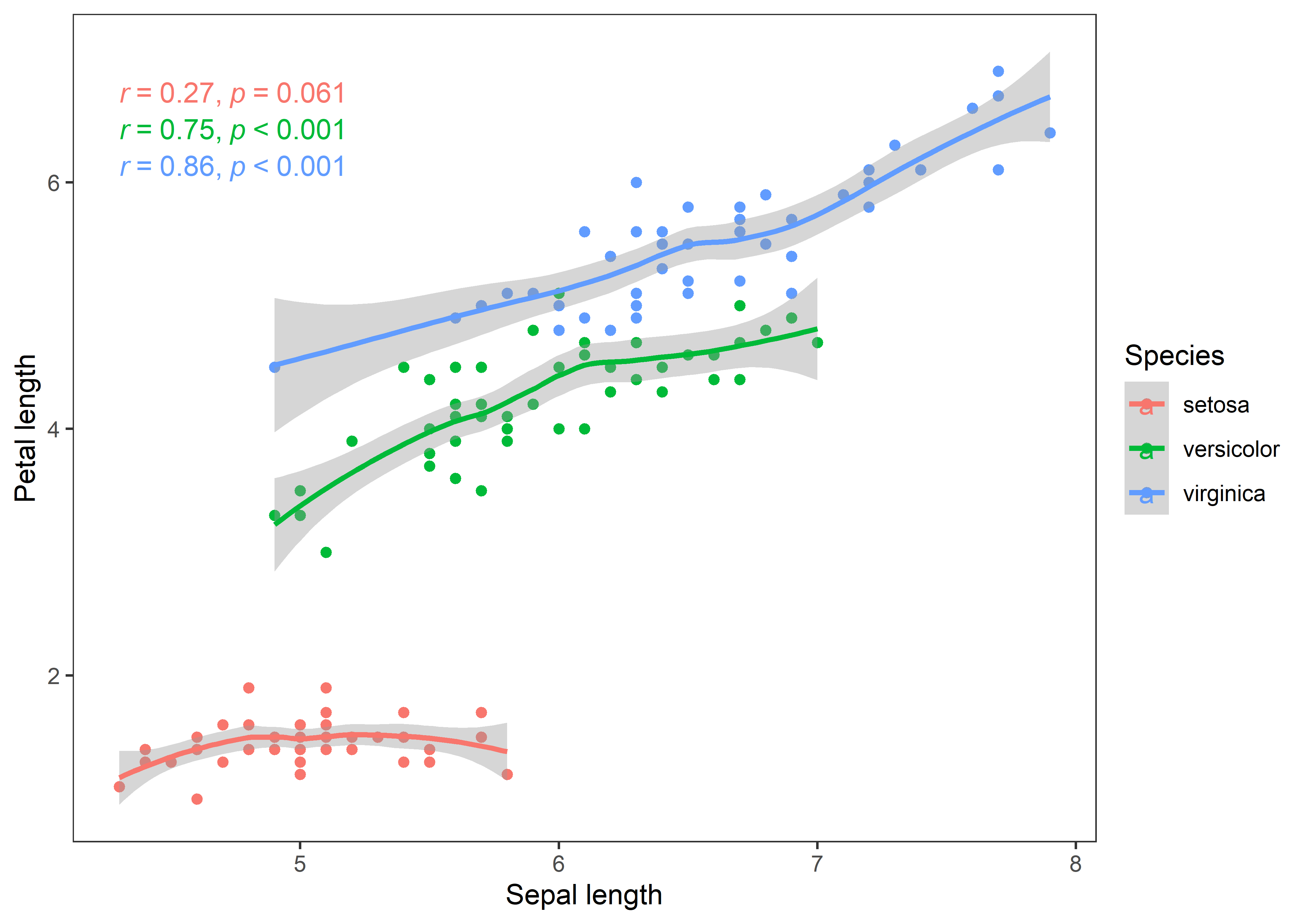
The curves depict clear story of the associations in all iris species. Now, I’ll bootstrap these estimates to test how robust are the correlation estimates between sepal and petal length in iris species. I’ll use the tidymodels packages which are useful for summarizing the result in a consistent format.
Bootsrapped correlation
As we want bootstrapped estimates for all iris species, I’ll nest the data by species. After that, I’ll define the bootstraps for each nested tibble using the bootstraps function inside purrr::map(). Then I ’ll perform the correlation test for each bootstrapped tibble (splits). Finally, I’ll unnest the tidied data frames so we can see the results in a flat tibble.
boot_corr <- iris %>%
  nest(data = -c(Species)) %>% # grouping the species
  mutate(boots = map(data, ~bootstraps(.x, times = 2000, apparent = FALSE))) %>% # defining bootstraps
  unnest(boots) %>% # un-nesting bootsrapped data lists
  mutate(correlations = map(splits, ~cor_test(Sepal.Length, Petal.Length, data = analysis((.))))) # performing correlation

corr <- boot_corr %>%
  unnest(correlations) %>% # unnesting tidied data frames
  select(-data, -splits, -id)

corr
## # A tibble: 6,000 x 9
## Species var1 var2 cor statistic p conf.low conf.high method
## <fct> <chr> <chr> <dbl> <dbl> <dbl> <dbl> <dbl> <chr>
## 1 setosa Sepal.Length Peta~ 1.5e-1 1.04 0.303 -0.135 0.410 Pears~
## 2 setosa Sepal.Length Peta~ 1.6e-1 1.10 0.276 -0.127 0.417 Pears~
## 3 setosa Sepal.Length Peta~ 1.4e-1 0.974 0.335 -0.145 0.402 Pears~
## 4 setosa Sepal.Length Peta~ 2.7e-1 1.95 0.0571 -0.00815 0.511 Pears~
## 5 setosa Sepal.Length Peta~ 1.3e-1 0.929 0.358 -0.151 0.397 Pears~
## 6 setosa Sepal.Length Peta~ 3 e-1 2.19 0.0333 0.0253 0.535 Pears~
## 7 setosa Sepal.Length Peta~ 2.4e-1 1.68 0.0987 -0.0452 0.483 Pears~
## 8 setosa Sepal.Length Peta~ 4.5e-1 3.50 0.00103 0.197 0.648 Pears~
## 9 setosa Sepal.Length Peta~ 2.1e-1 1.47 0.147 -0.0748 0.460 Pears~
## 10 setosa Sepal.Length Peta~ 6.7e-4 0.00464 0.996 -0.278 0.279 Pears~
## # ... with 5,990 more rowsVisualizing the bootstrapped estimates
There are many ways to visualize the bootstrapped estimates. Here are some of the examples below:
Distributions
# confidence interval
CI <- corr %>%
  group_by(Species) %>%
        summarise(lwr_CI = quantile(cor, 0.025),
                  .estimate = median(cor),
                  upr_CI = quantile(cor, 0.975))

corr %>%
  ggplot(aes(x = cor)) +
  geom_histogram(bins = 30, fill = "orange", alpha = 0.75) +
  geom_vline(aes(xintercept = 0), col = "lightgrey", lty = 2, size = 0.5) +
  geom_vline(aes(xintercept = cor), data = point, lty = 2, col = "red") +
  geom_rect(aes(x = .estimate, xmin = lwr_CI, xmax = upr_CI, ymin = 0, ymax = Inf), data = CI, alpha = 0.1, fill = "blue") +
  labs(x = "Correlation coefficient", y = "Count") +
  theme_test() +
  facet_wrap(~Species, ncol = 1)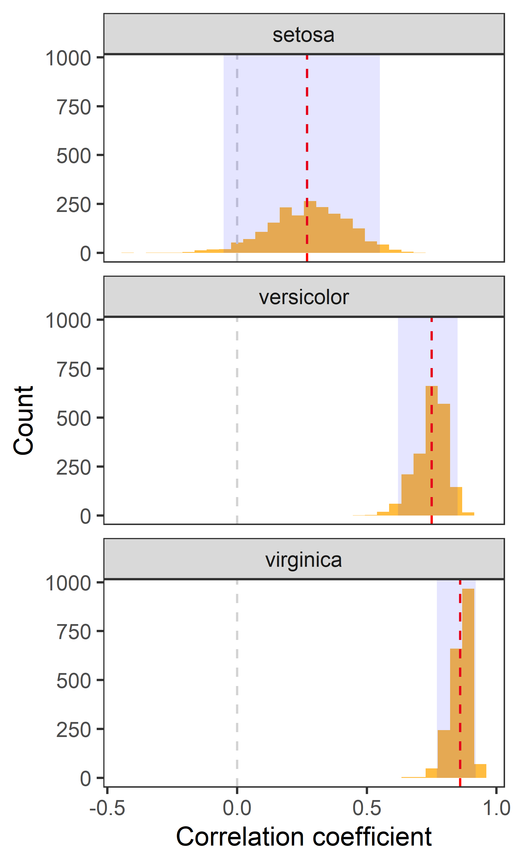
- Red dashed line indicates the point estimate of correlation.
- Grey dashed line indicates 0 i.e., no correlation.
- The shaded area indicates 95% confidence interval.
Jitter plot
corr %>%
  group_by(Species) %>%
  mutate(ci.95 = ifelse(cor > quantile(cor, 0.025) &  cor < quantile(cor, 0.975), "yes", "No")) %>%
  ggplot(aes(x = Species)) +
  geom_jitter(aes(y = cor, color = ci.95), alpha = 0.3) +
  scale_color_manual(values = c("grey", "salmon1"), guide = "none") +
  geom_point(aes(y = cor), data = point, shape = 3, colour = "black", size = 3) +
  theme_test()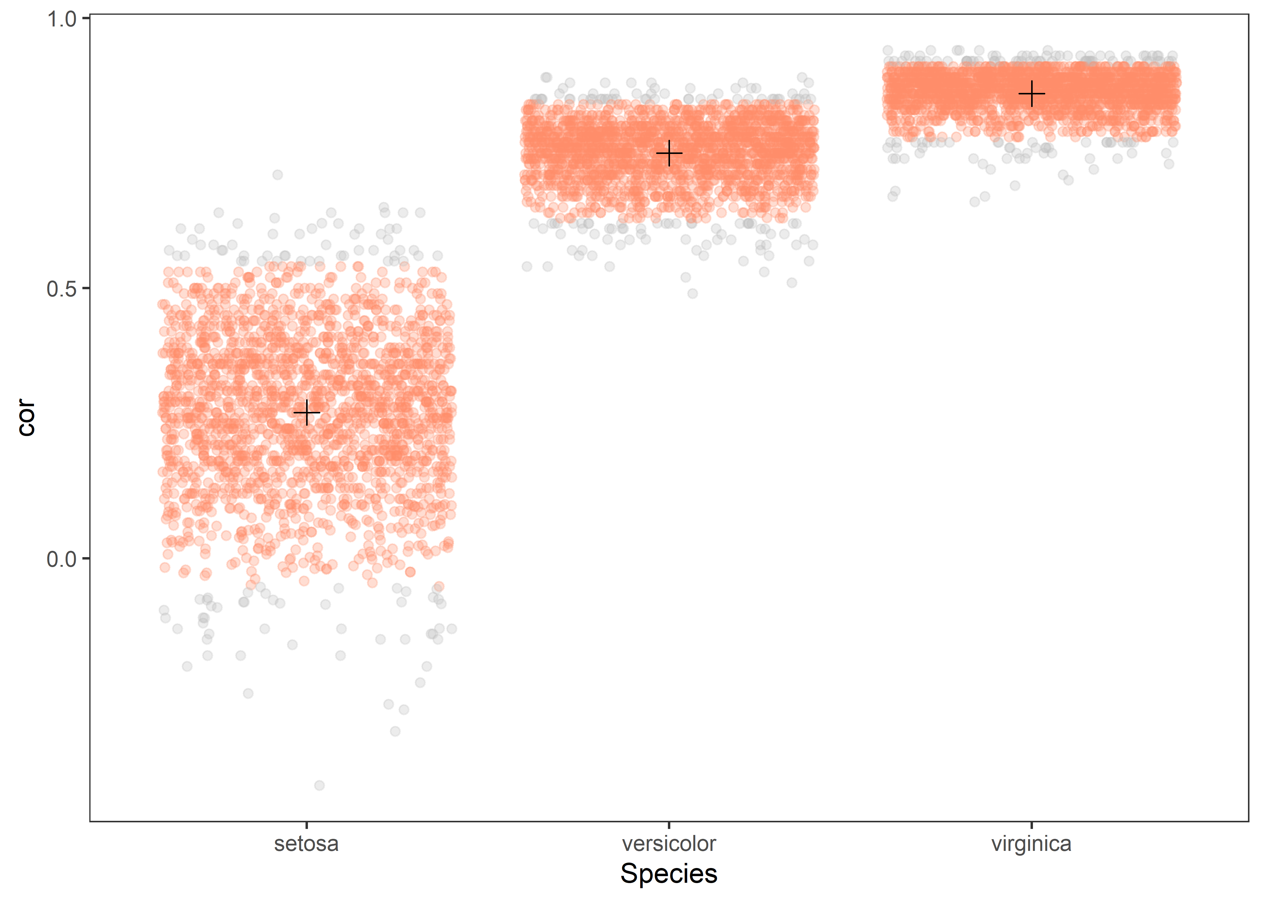
- The red color indicates estimates within 95% confidence interval.
- The
+sign represents the point estimate of observed correlation.
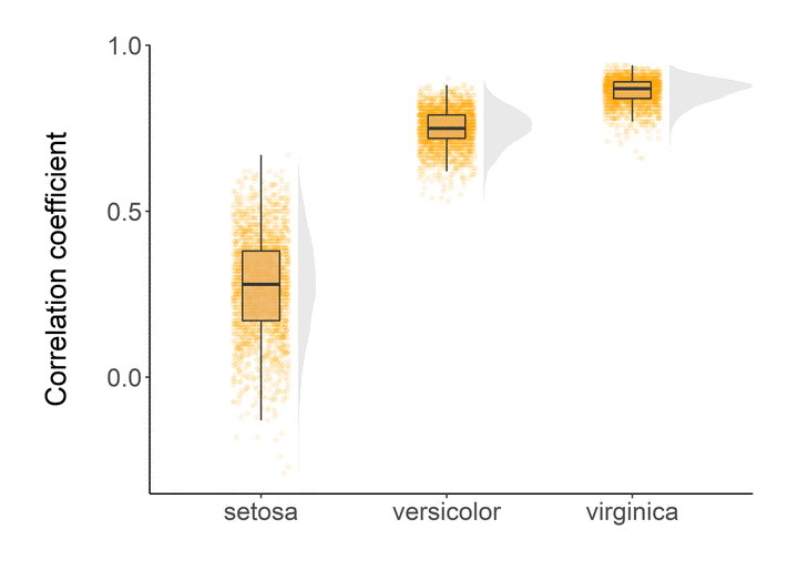
Raincloud
source("https://gist.githubusercontent.com/benmarwick/2a1bb0133ff568cbe28d/raw/fb53bd97121f7f9ce947837ef1a4c65a73bffb3f/geom_flat_violin.R")

theme_niwot <- function(){
  theme_bw() +
    theme(text = element_text(family = "Helvetica Light"),
          axis.text = element_text(size = 16),
          axis.title = element_text(size = 18),
          axis.line.x = element_line(color="black"),
          axis.line.y = element_line(color="black"),
          panel.border = element_blank(),
          panel.grid.major.x = element_blank(),
          panel.grid.minor.x = element_blank(),
          panel.grid.minor.y = element_blank(),
          panel.grid.major.y = element_blank(),
          plot.margin = unit(c(1, 1, 1, 1), units = , "cm"),
          plot.title = element_text(size = 18, vjust = 1, hjust = 0),
          legend.text = element_text(size = 12),
          legend.title = element_blank(),
          legend.position = c(0.95, 0.15),
          legend.key = element_blank(),
          legend.background = element_rect(color = "black",
                                           fill = "transparent",
                                           size = 2, linetype = "blank"))
}
corr %>%
ggplot(aes(x = Species, y = cor)) +
geom_flat_violin(position = position_nudge(x = 0.2, y = 0), colour = NA, fill = "lightgrey", alpha = 0.5) +
geom_point(aes(y = cor),
position = position_jitter(width = 0.15), size = 1, alpha = 0.1, color = "orange") +
geom_boxplot(width = 0.2, outlier.shape = NA, alpha = 0.8, fill = "#EBB261") +
labs(y = "Correlation coefficient\n", x = NULL) +
guides(fill = FALSE, color = FALSE) +
theme_niwot()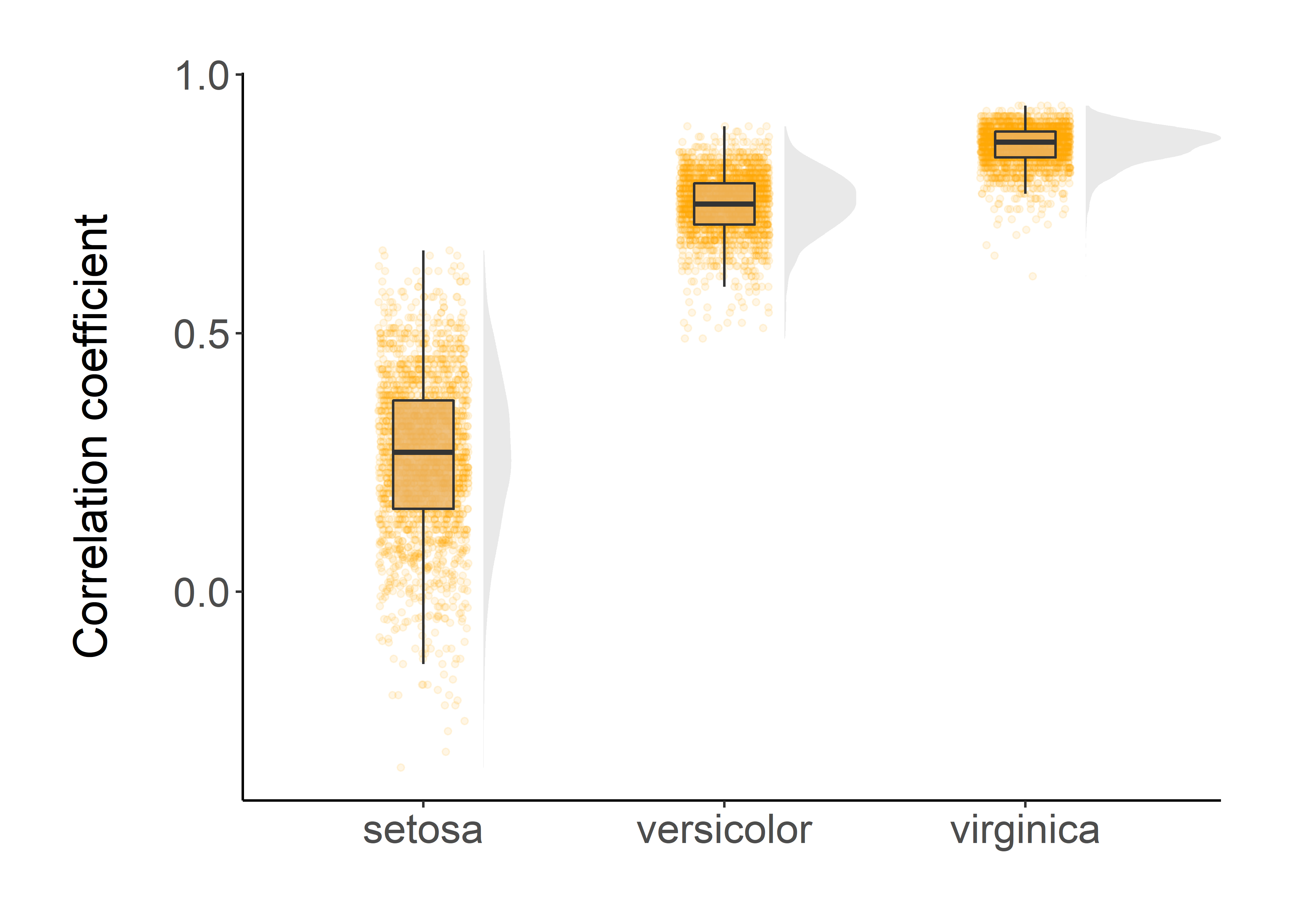
All of these visualizations indicates that our estimates of correlation coefficients are robust.
That’s it!
Feel free to reach me out if you got any questions.
Muhammad Mohsin Raza
Data Scientist
My research interests include disease modeling in space and time, climate change, GIS and Remote Sensing and Data Science in Agriculture.